
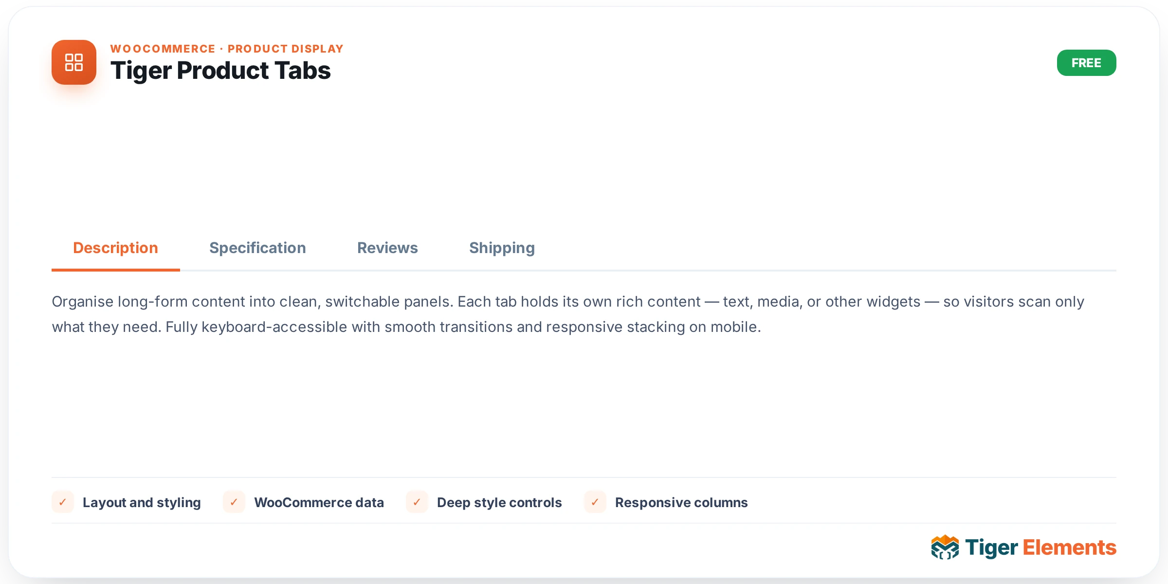
What it does
Tiger Product Tabs renders WooCommerce’s native single-product data tabs — Description, Additional Information, and Reviews — through the core woocommerce_output_product_data_tabs() function, wrapped in a .tg-ptabs container with a complete Elementor-Pro-style panel on top. Because it calls the real WooCommerce rendering pipeline rather than reimplementing it, any third-party plugin that hooks into woocommerce_product_tabs to add its own tab (a size-guide plugin, a shipping/returns tab, a custom specs tab) keeps working unmodified — Tiger only ever toggles or relabels the three built-in tabs it knows about, and leaves everything else in the array untouched. This widget requires WooCommerce and a resolvable product in scope: a single-product template, or a loop card where Tiger’s $tiger_loop_post_id global is set. Outside that context, the editor shows a hint (“Place this widget on a single-product template to preview the product tabs”) and the front end renders nothing.
Setting it up in Elementor
The Content tab’s “Tabs” section gives you a show/hide switcher plus an optional custom label for each of the three tabs. “Description Tab” defaults to Show, and when shown you can set a “Description Label” text field (placeholder “Description”) to rename it. “Additional Information Tab” works the same way, with an “Additional Info Label” field (placeholder “Additional information”). “Reviews Tab” likewise defaults to Show, with a “Reviews Label” field — this one is special: its description tells you to use {count} in the label text to inject the live review count (e.g. “Reviews ({count})” renders as “Reviews (7)”), pulled from $GLOBALS['product']->get_review_count() at render time. Below the three toggles sits “Hide Panel Headings”, a switcher that removes WooCommerce’s own “Description / Additional information / Reviews” <h2> heading that normally repeats inside each panel — handy since the tab nav already labels the section and the duplicate heading is often redundant.
Layout and styling
The Style tab’s Layout section has a responsive “Orientation” choose control (Horizontal/Vertical). Horizontal is the default block layout; Vertical switches the tabs container to flex with the nav and panel side by side, and reveals a “Vertical Nav Width” slider (120–480px or 15–50%, default 220px) that sizes the nav column while the panel takes the remaining space. A “Nav Alignment” choose control (Left/Center/Right) only appears when Orientation is Horizontal, and a “Gap Between Tabs” slider (0–60px) applies either way. “Tab Navigation” gives full typography for the nav links plus responsive padding and radius, then splits colors and borders across Normal / Hover / Active state tabs — each state gets its own text color, background, and border-color controls, plus a shared box-shadow group. “Panel” covers the content area: background, text color, link color, heading color (for any h1–h3 inside a panel), body typography, padding, margin, border, radius, and box shadow.
Non-obvious behavior
Tab visibility and relabeling are implemented as an instance-scoped filter on woocommerce_product_tabs at priority 98: the widget adds the filter immediately before calling WooCommerce’s tab renderer and removes it again right after, specifically so that two Product Tabs widgets on the same page (or a tabs widget alongside some other tabs consumer) never bleed settings into each other. The widget also temporarily swaps $GLOBALS['product'] to the resolved product for the duration of the render and restores the previous value afterward — this matters because WooCommerce’s tab callbacks (and the review-count lookup for the {count} token) read that global directly rather than accepting a product argument.
When to use it vs. Tiger Product Reviews
The standalone Tiger Product Reviews widget (also shipped in this plugin) renders reviews completely independently of the tabs system, by calling WordPress core’s comments_template() directly against the product post — the same rating summary, review list, and comment form with star selector you’d see on a stock WooCommerce page, but placeable anywhere on the layout, not nested inside a tab panel. It has its own granular toggles, “Show Reviews List” and “Show Review Form”, that let you show just the list or just the form; Product Tabs has no equivalent per-part control over the reviews content itself — inside the tabs widget, “Reviews Tab” is an all-or-nothing show/hide plus a relabel. Use Product Tabs’ Reviews tab when you want the conventional tabbed experience with reviews as one of several panels. Use the standalone Reviews widget when you want reviews surfaced as their own section — e.g., below the tabs, in a two-column layout, or with the form and list separated onto different parts of the page. Note also that the Reviews widget does not render in the Elementor editor canvas at all (it needs the live front-end comment query), showing only a text hint, whereas Product Tabs’ preview works fully once a product is resolvable.
Practical tips
- If you rename the Reviews tab, keep the
{count}token in the label — dropping it silently loses the live count and just shows your static text, which can look stale on high-review products. - Use “Hide Panel Headings” when your Tab Navigation already makes the section obvious; leaving WooCommerce’s repeated in-panel headings on can look duplicated, especially in Vertical orientation where the nav label sits right beside the panel.
- Switching to Vertical orientation is a good fit for spec-heavy products with a long Additional Information table — pair it with a wider “Vertical Nav Width” if your tab labels are long or renamed.
- Because the widget delegates to WooCommerce’s real tab system, any tab added by another plugin (shipping info, size charts, etc.) will still appear even though there’s no Tiger control for it — test with those plugins active before assuming a “missing” tab is a bug.