
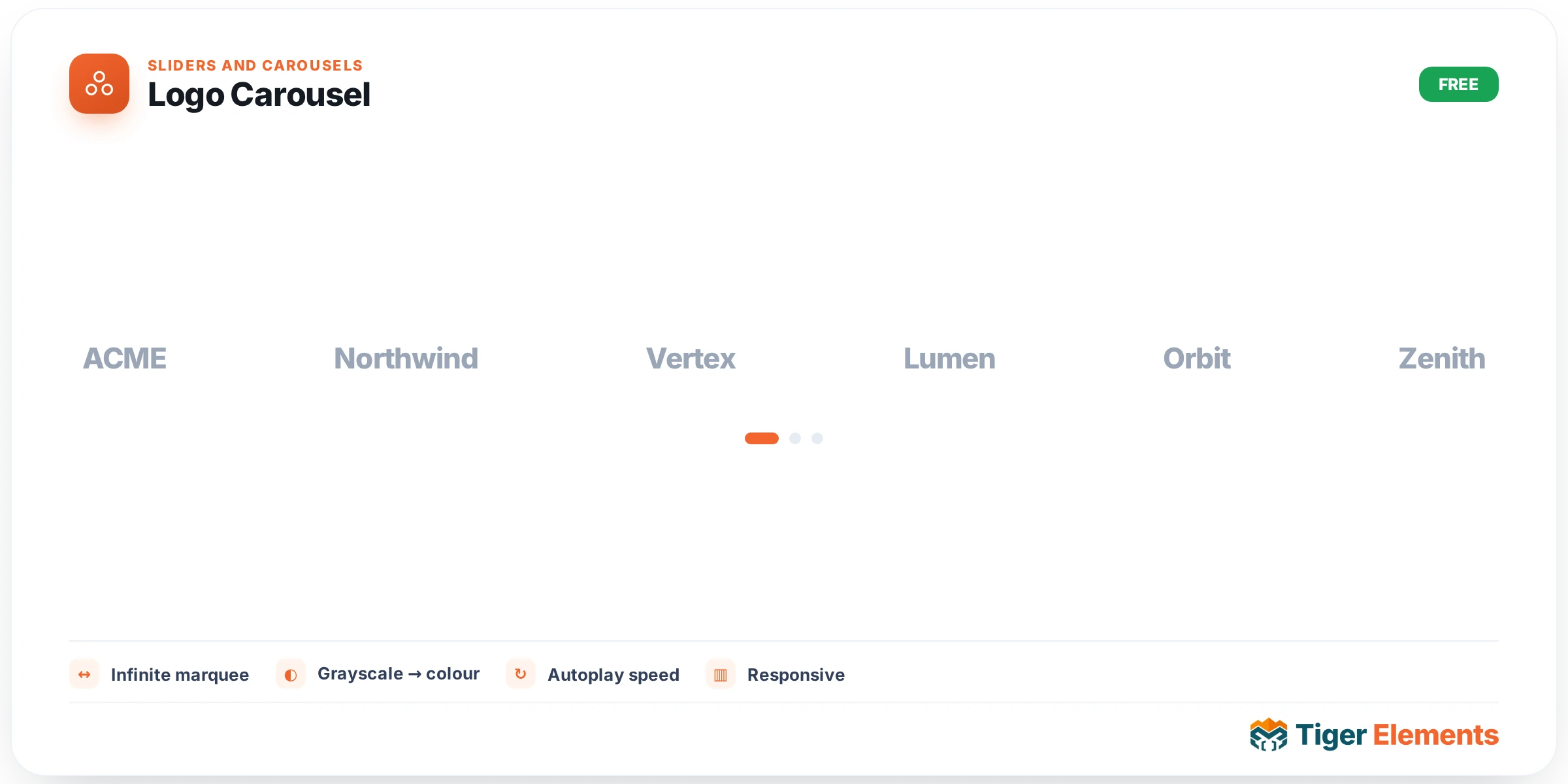
A client or partner logo showcase — either a static grid or an infinite marquee-style scrolling carousel — built from a repeater of logo images with name/alt text for each. Two genuinely different purposes share this one widget: the "as featured in" press-logo row common on a homepage’s opening section, and the "our clients" trust-signal row demonstrating an established customer base, both of which follow the same underlying visual pattern of a horizontal row of recognizable brand marks.
Choosing grid or marquee
The Layout control switches between a fixed static grid — logos arranged in a stable row or wrap pattern, all visible simultaneously with no motion — and a continuously scrolling marquee, where the logo row moves in an infinite horizontal loop. A static grid suits a short, curated list of logos where every one deserves equal, permanent visibility without any of them ever leaving view; it also tends to feel calmer and more appropriate for a smaller number of genuinely important partner logos. A marquee is the better choice once the logo list grows past what comfortably fits in one row, letting you feature considerably more brands than a static grid’s available width would allow, at the cost of any individual logo only being visible some of the time as the row scrolls past.
Navigation on the carousel layout
When the carousel layout is active, navigation arrows get their own independent Normal and Hover style states, letting a visitor manually control the scroll direction and pace if they want to examine a specific logo more closely rather than waiting for the automatic scroll to bring it back around.
Why alt text and naming matter here specifically
Because every logo entry carries its own name/alt text field, this widget handles an accessibility and SEO detail that’s easy to overlook with a purely visual logo row: a screen reader announcing "Acme Corp logo" rather than a generic, unlabeled image genuinely improves the experience for visitors using assistive technology, and descriptive alt text also gives search engines meaningful context about which brands and partners a page is actually associated with.
Use it for
A homepage’s "trusted by" or "as featured in" band is the most common placement — typically positioned high on the page, right after the hero section, as an early trust signal before a visitor has scrolled far enough to evaluate anything else. A dedicated partners or clients page is a secondary use case, particularly suited to the static grid layout when the full list of partnerships genuinely deserves individual, non-scrolling attention rather than a quick scanning row.
Practical tips
- Use consistent logo sizing and background treatment across every entry — a row mixing logos with wildly different aspect ratios, colors, or backgrounds (some on white, some transparent, some with visible padding) reads as unpolished regardless of how well the widget itself is configured.
- Switch to the marquee layout once you’re genuinely past the number of logos a static row can comfortably display — forcing too many logos into a fixed grid tends to shrink each one to an illegible size rather than solving the space problem cleanly.
- Always fill in real, specific alt text per logo rather than leaving it generic or blank — this is one of the more overlooked accessibility details on an otherwise purely visual widget.