
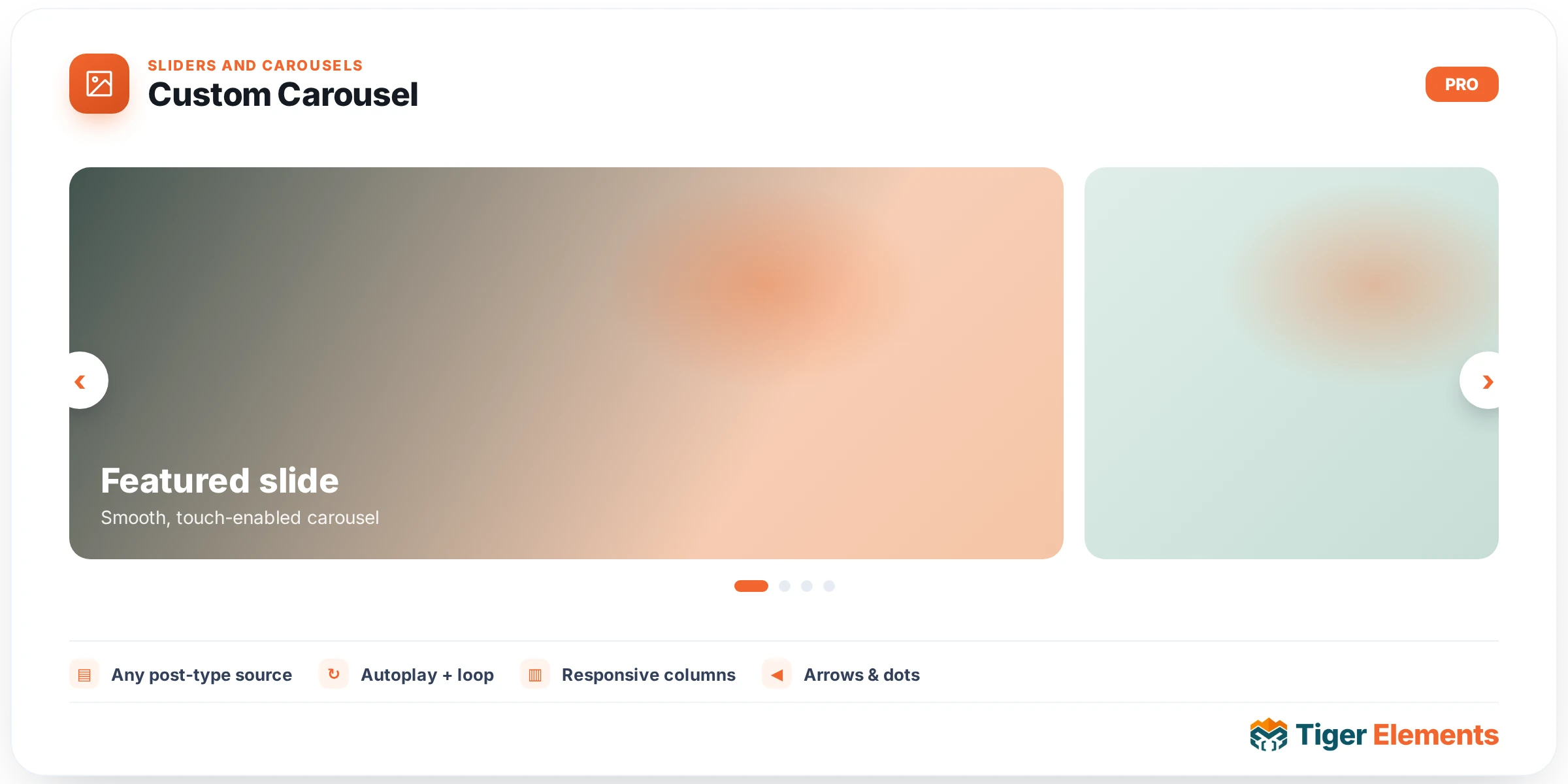
A flexible multi-item carousel — an items repeater carrying image, title, description, and button per entry, combined with slides-per-view and space-between controls that let more than one card show at a time, unlike a full-bleed hero slider where each slide occupies the entire visible width on its own.
Why multi-item matters
A traditional hero slider is built around the assumption that each slide deserves the visitor’s full, undivided attention — one large image, one headline, one message, then the next slide replaces it entirely. That’s the right structure for a hero banner, but it’s the wrong structure for content that’s fundamentally a collection of comparable items — a set of product highlights, a row of service offerings, a gallery of client logos with accompanying text. Custom Carousel is built for that second category: slides-per-view determines how many cards are visible simultaneously (two, three, four, however many comfortably fit), and space-between sets the gap separating them, together producing a browsable row of cards rather than a single full-width slide replacing itself.
Per-item content
Each item in the repeater carries an image, a title, a description, and a button — enough structure for a genuine feature or product card, not just a bare image. This makes the carousel suitable for content that needs more than a caption; a service offering with a real explanation and a call-to-action link fits naturally into this structure, where a simpler image-only carousel would fall short.
Navigation and autoplay
Autoplay and loop toggles control whether the carousel advances on its own and whether it cycles continuously back to the start once it reaches the end, while navigation arrows and pagination switchers give visitors direct manual control regardless of the autoplay setting — letting someone who wants to browse at their own pace step through cards deliberately rather than waiting for or fighting against automatic advancement.
Use it for
A row of featured products or services where several items deserve roughly equal visual weight side by side, a logo-plus-testimonial-snippet carousel, or any "browse through several comparable options" pattern where a single full-width slide-per-slide hero slider would feel like the wrong structural fit — the content genuinely wants to be seen as a browsable set, not one item at a time replacing the last.
Practical tips
- Set slides-per-view based on how much content each card genuinely needs to display comfortably — cramming too many cards into the visible width shrinks each one’s image and text to an illegible size.
- Keep descriptions reasonably short and consistent in length across items — cards of noticeably different heights within the same row tend to look uneven, particularly if the carousel doesn’t equalize card heights automatically.
- Turn on both navigation arrows and pagination together when the item count is more than a handful — arrows suit step-by-step browsing while pagination dots give an at-a-glance sense of total position, and having both covers different visitor preferences.
Requirements and performance notes
This widget carries no dependency on WooCommerce or any other module — it works with any content you build into the item repeater, so it’s just as suitable for a services carousel on a consulting site as it is for a product highlight row in a shop. Because each card’s image, title, description, and button are set directly on the repeater rather than pulled dynamically from post data, there’s no query configuration to worry about; everything is authored by hand inside the widget itself.
Since the carousel runs on the underlying Swiper engine shared with Tiger’s other slider widgets, its touch and drag behavior on mobile is consistent with the rest of the plugin’s carousel-based widgets — visitors can swipe between cards on a phone the same way they would on any other Tiger slider or gallery.