
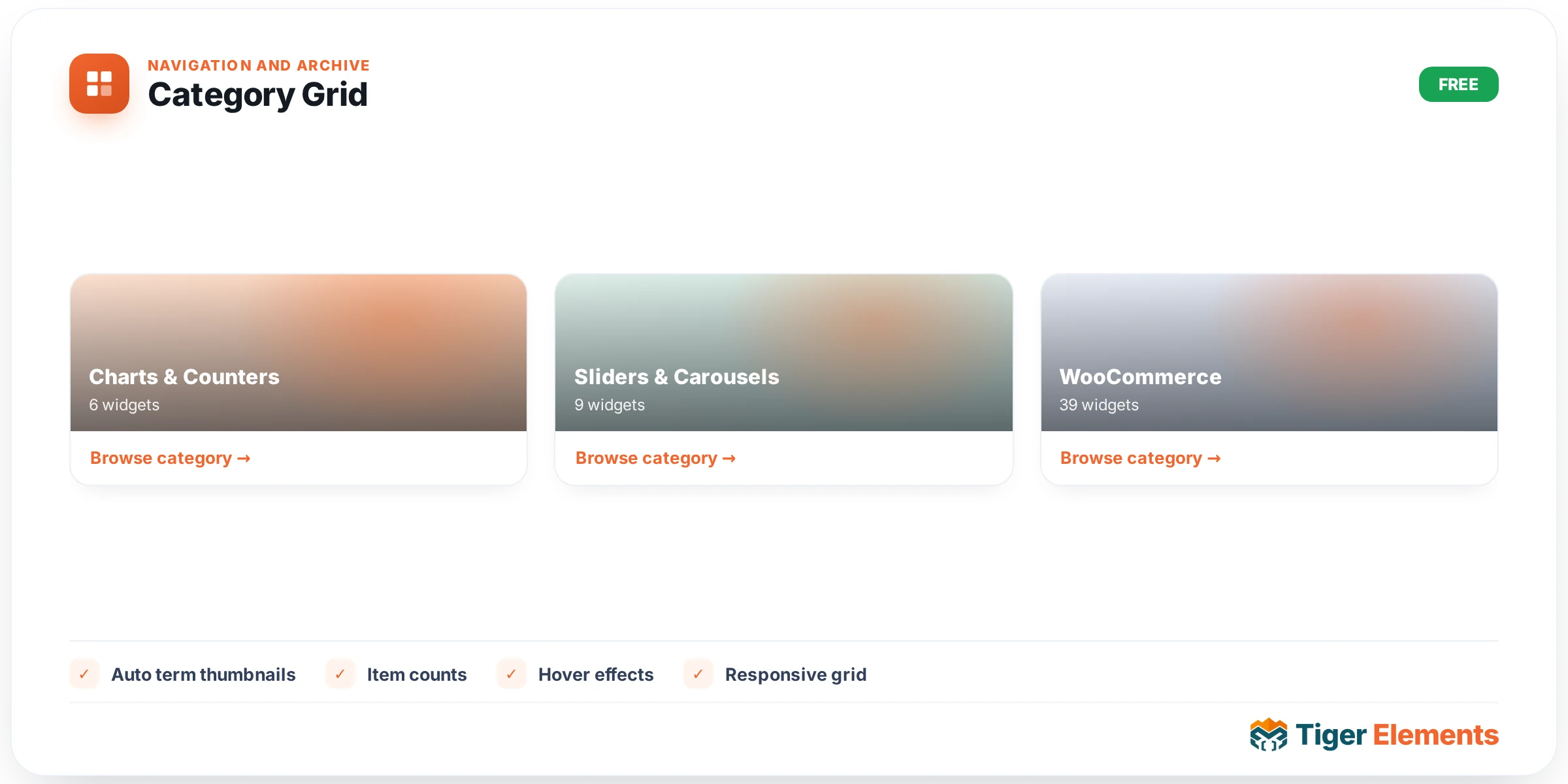
The Category Grid widget lays out your taxonomy terms — blog categories, WooCommerce product categories, or any custom taxonomy — as a responsive grid of linked cards, each with an optional image, post count, description and “read more” link. It shares the Tiger Query Builder engine, so the same term-source logic that powers dynamic loops is available here.
Where: Elementor editor → search the widget panel for Category Grid (Tiger Elements category). Drop it onto any page or template.
What it does
Instead of hand-building a set of category tiles, the Category Grid queries a taxonomy and renders one card per term. Cards link to the term archive by default, so it works as a “browse by category” block for shops, blogs and knowledge bases.
Choosing which terms show (Query)
The Query section controls the term set:
- Taxonomy — which taxonomy to pull terms from (Category, Product Category, or any registered public taxonomy).
- Source — All terms, Top level only, Children of a term, All descendants of a term, or one of the context-aware options that adapt to the page being viewed: Children / Descendants / Parent / Siblings of current term, and Terms of current post. The “current” options only resolve on a taxonomy archive or single post.
- Parent term — the anchor term, shown when Source is Children of a term or All descendants of a term.
- Include only / Exclude — whitelist or blacklist specific terms.
- Hide empty terms — drop terms with no posts (on by default).
- Order by (Name, Post count, Slug, ID) and Order (Ascending / Descending).
- Number of terms (default 12) and Offset to page through a large set.
Card content
The Card section decides what each tile shows:
- Show image and Image size — uses the term’s attached image where one exists.
- Title tag — H2–H6, div or span (pick the heading level that fits your page outline).
- Post count — Hidden, Beside title, or a Badge on image.
- Show description and Description words (default 18) — trims the term description to a set length.
- Show “read more” and Read more text (default “Browse”).
- Card link — make the whole card link to the term archive, or turn linking off.
Layout
The Layout section sets Columns (responsive — defaults to 3 on desktop, 2 on tablet, 1 on mobile) and the Gap between cards.
Styling
The Style tab groups everything you’d expect: Card (background, body padding, border radius, border, box shadow, plus a hover lift and hover shadow), Media (height, zoom-on-hover, overlay color) and Typography (title, description, count and read-more colors and fonts, including the count-badge background).
Tips
- For a shop “shop by category” row, set Taxonomy to Product categories, Source to Top level only, and the count position to a Badge on image.
- Use the Children of current term source inside a taxonomy archive template to build a self-updating sub-category browser that needs no manual editing per category.
- Set your global design tokens first so card colors and fonts inherit your brand automatically.
Troubleshooting
No cards appear.
Check that the chosen taxonomy actually has terms, and that Hide empty terms isn’t hiding them all because none have posts yet. If you used a “current” Source, remember it only resolves on the matching archive/single context, not in the editor preview.
Cards have no images.
Term images come from the taxonomy’s attached image field. Categories without an image simply render text-only cards.