
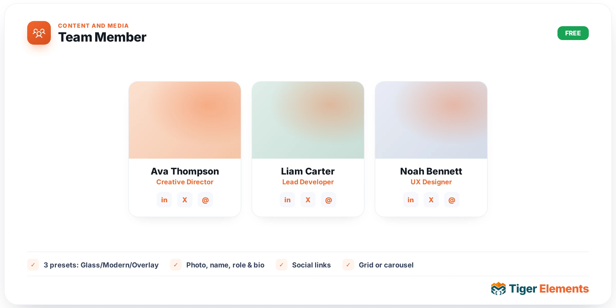
A team/staff profile card widget with three built-in visual presets — Glass, Modern, and Overlay — built from a repeater of team members, each with a photo, name, role, bio, and social links. The classic "Meet the Team" grid appears on nearly every company website, and this widget covers the three most common visual treatments a designer would otherwise have to build by hand: a frosted, translucent overlay style, a clean flat modern card, and an image-with-overlaid-info layout.
Choosing a preset
Glass applies a frosted-glass panel treatment to the info section, letting a photo show through with soft translucency behind the name and role text — a look well suited to sites with a modern, tech-forward visual identity. Modern is a cleaner, flatter card layout where the photo and information sit in distinct, clearly separated zones — the safer, more broadly applicable choice for corporate and professional service sites. Overlay places the name, role, and social links directly on top of the photo itself, typically anchored to the bottom with a gradient scrim ensuring the text stays readable against varied photo backgrounds — a more editorial, photography-forward treatment that works best when the team photos themselves are strong, well-composed images.
Per-member content
Each entry in the repeater carries its own photo, name, role/title, a short bio, and social profile links — enough structure to cover both a minimal card (just photo, name, role) and a fuller one that includes a brief bio and links to each person’s professional profiles. An optional badge text field per member allows a callout distinct from the role itself — "Founder", "New Hire", a department label — useful when a specific subset of the team deserves an extra visual flag beyond their standard title.
Layout controls
Responsive columns (one through six) determine how the team grid arranges across different screen sizes, and a content alignment control sets whether each card’s text is left-aligned, centered, or otherwise positioned within its own space — a decision that should generally match the preset’s overall visual character (centered alignment tends to suit the more symmetrical Overlay and Glass treatments, while left-aligned text can read more naturally in a Modern card layout).
Use it for
Company "About Us" and "Meet the Team" pages are the primary application, and the widget scales naturally from a small founding team of two or three people to a larger organization-wide staff directory, since the grid’s column count and card size adapt to however many entries the repeater actually contains.
Practical tips
- Choose a preset based on the actual quality and consistency of your team photos — Overlay demands strong, well-composed photography since the text sits directly on the image, while Modern is more forgiving of a mix of photo styles and quality since the photo and text zones stay visually separate.
- Use the badge field sparingly and consistently — applying it to every single team member dilutes its usefulness as a genuine callout; reserve it for the handful of people who genuinely warrant the extra label.
- Keep bio text genuinely short if you’re using a grid with more than four or five columns — a lengthy bio squeezed into a narrow card column tends to look cramped rather than informative.