
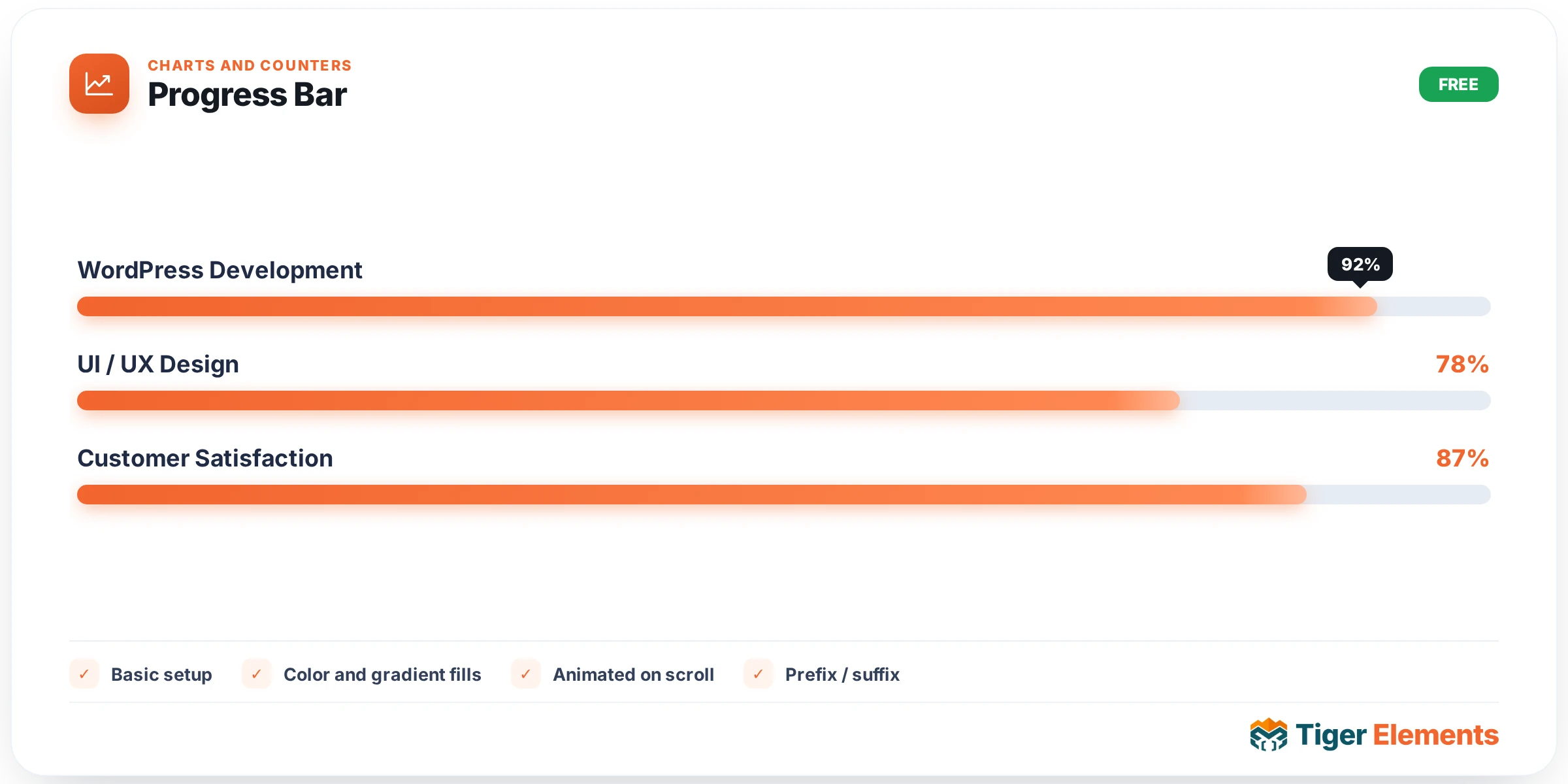
An animated linear progress indicator for skills, stats, or any labeled percentage — a widget that animates from zero to its target value the moment it comes into view, rather than appearing already-full and static the instant the page loads. That animation matters more than it might seem: a bar that’s already at its final value before a visitor has even noticed it reads as inert decoration, while a bar that visibly fills as the visitor scrolls to it draws attention and communicates the value more memorably.
Basic setup
Set a label (the skill or stat name — "WordPress Development", "Customer Satisfaction") and a percent value, then optionally toggle showing the numeric value alongside the bar with a customizable prefix and suffix — turning a plain 87 into "$87k", "87%", or "87+" depending on what the number actually represents.
Visual embellishments beyond a plain bar
Several switches push this well past a basic filled rectangle. A glow effect adds a soft luminous edge around the filled portion, giving the bar more visual weight and a slightly premium feel. A sweeping shine animation periodically passes a highlight across the fill, adding subtle ongoing motion even after the initial fill-up animation has completed — useful for keeping a stat section from feeling entirely static once the page has settled. A value bubble tracks the leading edge of the fill as it animates, showing the live percentage climb in real time rather than only revealing the final number once the animation stops — genuinely more satisfying to watch than a bar that fills silently and only then reveals its number. A segmented track style breaks the bar into discrete blocks rather than one continuous strip, evoking something closer to a battery-level or loading-stage indicator than a smooth progress bar, and rounded caps softens the bar’s ends for a friendlier, less rigid overall look.
Color and gradient fills
The fill itself supports an optional second gradient color independent from the track (unfilled background) color — meaning the bar’s fill can be a genuine color gradient sweep rather than flat color, adding visual interest without requiring any of the glow or shine effects to be turned on. Track color is styled entirely separately, so a bar can sit on a subtle muted background track while the fill itself carries a bold, brand-forward gradient.
Use it for
Skill bars on an "About" or resume-style page are the classic use case — a design or development skill shown as a percentage, animated in as the visitor scrolls to that section. Funding or campaign-goal trackers are a second strong fit, where the percentage genuinely represents progress toward something concrete. Comparison stats between competing options — "our product scores 94% on X, the alternative scores 61%" — are a third application, where two or more progress bars placed side by side make the comparison immediately visual rather than requiring a visitor to compare raw numbers.
Practical tips
- Use the value bubble specifically when the percentage climb itself is part of the story you want to tell — for a simple static comparison, a plain end-state number may communicate just as clearly with less visual noise.
- Keep glow and sweeping shine to a small number of bars per page — applied to every single bar in a long stat list, the combined motion becomes distracting rather than each individually adding polish.
- For skill-comparison sections, keep track color consistent across every bar and vary only the fill — this keeps the visual focus on the actual percentage differences rather than on inconsistent bar styling.