
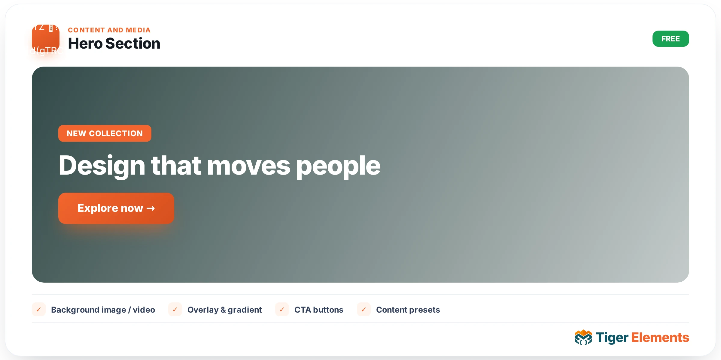
Hero Section is Tiger Elements’ full-page opening banner widget — the block most sites put directly under the header to state, in one glance, what the site does and what the visitor should click next. It was ported into Tiger Elements from the standalone Tigelehero plugin and rebuilt to Tiger’s conventions, but the design system underneath is unusually deep for a “hero” widget: instead of one look with a few color options, it ships eight complete visual identities plus independent controls for layout, background mechanics, decorations, and entrance animation, so a builder can land on something that looks bespoke without writing custom CSS.
Layout and design presets
Everything begins in the Layout section. The Layout Style select has four real options: Centered, Left Aligned, Right Aligned, and Split (Text + Image). Split mode is the only one that pairs your copy with an actual image column, and it unlocks a Reverse Columns switcher so the image can sit on either side without rebuilding the section. Sitting right below it is the widget’s signature control, Design Preset, an eight-way select: Modern Dark (the default), Glassmorphism Card, Cyberpunk Neon, Minimalist Light, Vibrant Aurora Mesh, Retro Synthwave Grid, Neo-Brutalism Flat, and Dark Luxury Gold. Each preset changes the section’s underlying visual treatment as a package — think of it as a starting theme you then fine-tune with the Style tab, rather than a filter layered on top. Hero Height offers 100vh (Full Screen), 80vh, 60vh, 40vh, or Custom, and choosing Custom exposes a responsive Custom Height slider (px/vh/em) so mobile and desktop can have genuinely different section heights. A Content Max Width slider caps how wide the text column gets before wrapping.
Badge, heading, description, and buttons
The Badge / Pre-Title section is the small pill of text that usually sits above the headline (e.g. “🚀 New Release”). It’s gated by a Show Badge switcher, with Badge Text (dynamic-tag capable) and a Badge Style select — Pill, Outline, or Gradient. The Heading section takes a Heading textarea plus a separate Highlighted Word(s) text field: whatever word or comma-separated words you type there get automatically wrapped in the gradient-highlight treatment inside the heading, which is a genuinely useful shortcut over manually spanning text. A HTML Tag select (h1/h2/h3/div/span/p) controls the semantic output — worth setting deliberately for SEO, since only one H1 should exist per page. Description is a simple dynamic-tag-aware textarea. Buttons are split into fully independent Primary and Secondary groups, each with its own show/hide switcher, Text, a URL-type Link field (dynamic tags supported), an Icons control, and an Icon Position select (Before/After) — so you can run icon-less, icon-leading, or icon-trailing buttons on each side independently.
Image, social proof, background, and animation
When Layout Style is set to Split, a Hero Image section appears with a Choose Image media control, an image-size group control, and a Float Animation switcher that adds a subtle idle bobbing motion to the image. The Social Proof section is built for the classic “trusted by” strip: a Show Social Proof switcher gates Text, a Show Avatar Stack switcher backed by a repeater of avatar images (five placeholder avatars ship by default), and a Show Star Rating switcher paired with a Rating number field (1–5, step 0.1, default 4.9). Background is the most mechanically complex section: Background Type offers Solid Color, Gradient, Image, Video, Animated Gradient, and Particles. Gradient and Animated Gradient expose three gradient color stops plus a Gradient Angle slider; Image mode adds a Background Image control, a Parallax toggle, and a Parallax Speed slider (0.1–1.0); Video mode takes a raw Video URL (dynamic-tag capable); Particles mode exposes a single Particle Color. Image and Video modes both get an independent overlay layer (Show Overlay + Overlay Color). Decorations adds two more atmospheric switches, Show Grid Pattern and Show Glow Orbs, the latter with three configurable Orb Color fields. Finally, the Entrance Animation section offers a seven-way Animation Style select (None, Fade Up, Fade In, Slide Up, Zoom In, Blur In, Staggered) with Duration and Delay number fields in milliseconds.
When to use it
Use Centered or Left Aligned with a Gradient or Animated Gradient background for a SaaS/product landing page above-the-fold section. Use Split with Reverse Columns and Float Animation on for a product-screenshot-led marketing page where the image needs to visually balance a shorter headline. Use Neo-Brutalism Flat or Cyberpunk Neon with Show Glow Orbs and Show Grid Pattern for a portfolio, agency, or event site that wants a distinctive, non-corporate first impression rather than the safe default look.
Practical tips
Set Heading Tag to h1 only on the actual page-level hero — if the widget is reused inside a template part or repeated section, downgrade it to h2/div to avoid duplicate H1s hurting SEO. When using a Background Type of Video, keep Show Overlay on with a reasonably dark Overlay Color; without it, button and heading contrast tends to break on busy footage. If you enable Parallax on an Image background, test on an actual mobile device — parallax scroll listeners can visibly stutter on lower-end phones even though they read smoothly in the desktop editor preview. Pick a Design Preset first, then adjust only the Style-tab colors you need to change — because each preset bundles a matched palette across badge, heading highlight, buttons, and orbs, mixing presets with heavy manual overrides usually fights the built-in color harmony rather than improving it.