
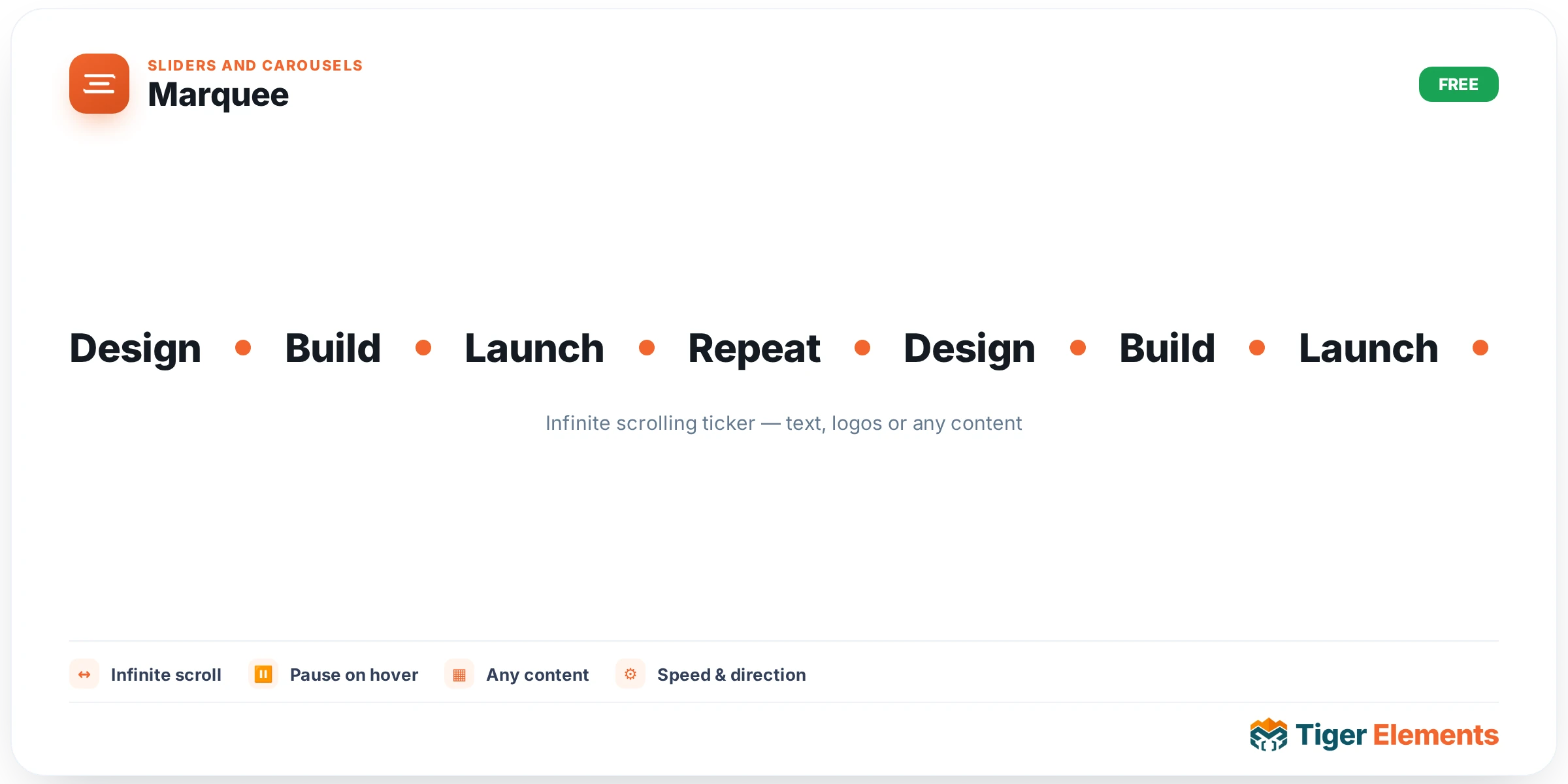
An infinite, horizontally-scrolling ticker of text items — announcements, taglines, or a scrolling list of features and benefits — driven by a repeater with a configurable separator placed between consecutive items. Where most content on a page sits still and waits for a visitor to scroll to it, a marquee introduces genuine, continuous motion, which makes it an effective way to draw attention to a short list of messages that might otherwise get lost in a static layout.
Building the content list
Each repeater entry is a single text item — a short phrase, a tagline, an announcement line — and a configurable separator (a bullet point, a dash, a small icon) sits between consecutive items as the row scrolls, visually distinguishing where one message ends and the next begins without needing extra whitespace to do the job.
Controlling the motion
Speed, expressed as seconds per full loop, sets how quickly the entire ticker cycles through its content once and returns to the start — a faster speed feels energetic and attention-grabbing but risks becoming unreadable if the text is genuinely meant to be read rather than just glanced at, while a slower speed gives visitors time to actually absorb each message as it passes. Direction chooses whether the content scrolls left or right, a purely stylistic choice with no functional difference beyond matching whatever visual rhythm fits the surrounding page.
A pause-on-hover switcher is a genuinely important usability consideration rather than a cosmetic extra: with it on, a visitor who wants to actually read a specific item can simply hover their cursor over the marquee and the scrolling motion stops, giving them time to read at their own pace rather than chasing continuously moving text. Without it, any content genuinely worth reading in full — rather than just glancing at as an ambient visual element — becomes frustrating to actually consume, since the text never stops moving long enough to read comfortably.
Choosing content that suits continuous motion
A marquee works best with content that’s meant to be absorbed as an ambient, glanceable signal rather than read word-for-word — a rotating list of feature highlights, a series of short taglines, a scrolling announcement bar. It’s a poor fit for content that genuinely requires careful, deliberate reading, since even with pause-on-hover enabled, the default moving state signals to a visitor that the content isn’t meant to be read closely — which is precisely the wrong impression to give for anything actually important enough to demand full attention.
Use it for
A site-wide announcement or promotional ticker (a limited-time offer, a shipping deadline notice), a scrolling list of brief feature highlights below a hero section, or a rotating tagline strip that adds a bit of dynamic visual texture to an otherwise static page section.
Practical tips
- Always enable pause-on-hover unless the content is genuinely purely decorative — for anything with real informational value, forcing a visitor to catch text mid-scroll rather than read it comfortably undermines the point of including the content at all.
- Keep individual items short — a marquee’s readability degrades quickly with long text, since a visitor has to track a longer moving string across a wider span of the screen.
- Match speed to content length and importance — a fast scroll suits short, punchy taglines meant as ambient texture, while anything with real informational weight needs a slower pace (and pause-on-hover) to actually be usable.