
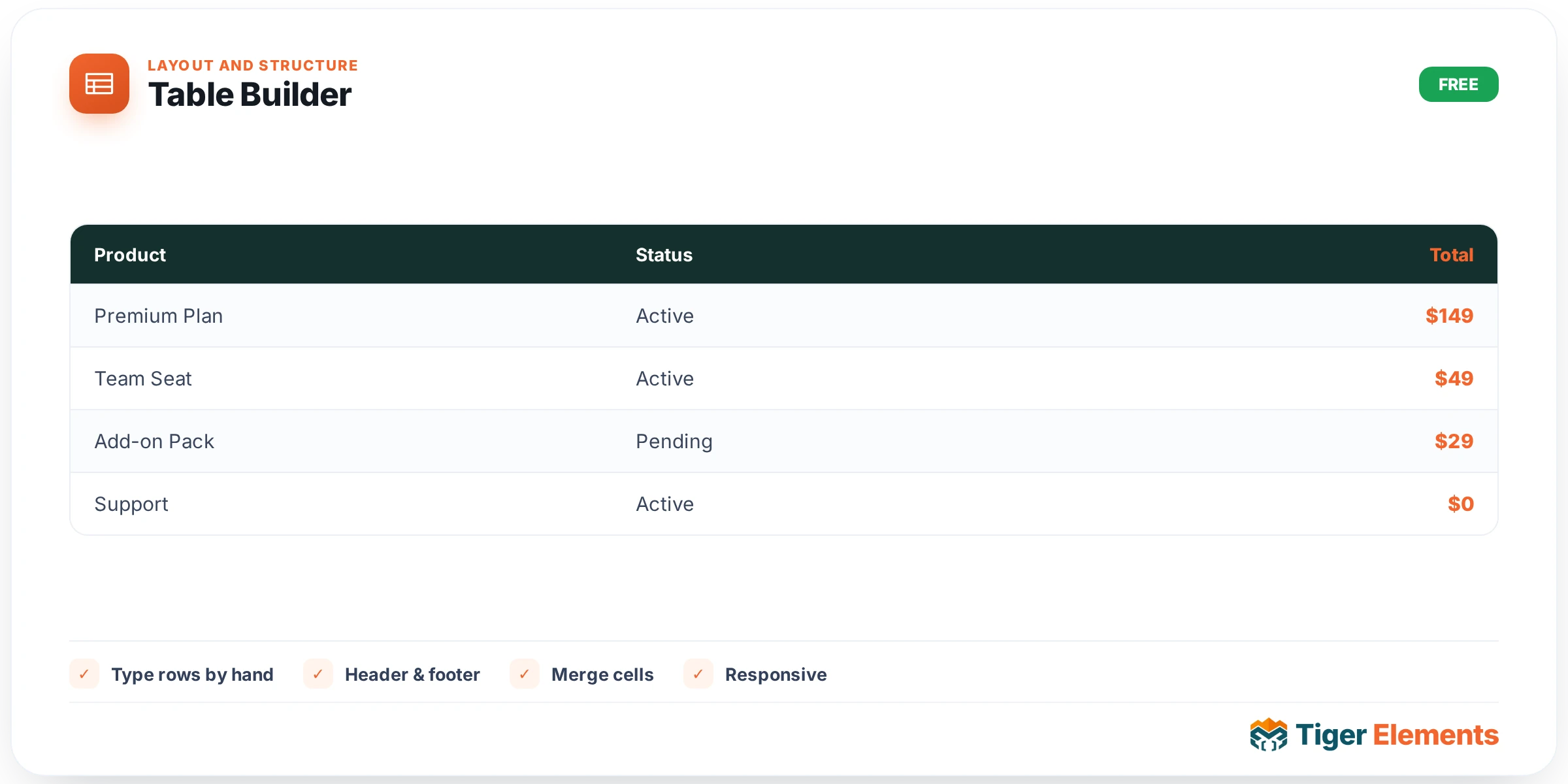
A manually authored data table for content that doesn’t come from a database query — comparison charts, spec sheets, simple pricing grids — where the content is typed directly into the table rather than pulled from posts, products, or an external file. This is a deliberately simple, self-contained widget: no query configuration, no external connection, just a grid of cells you fill in by hand, which makes it the right tool for content that’s genuinely static and won’t need to sync with a changing data source elsewhere.
Setting up the structure
Choose the number of columns — anywhere from one to six — before adding content, since that decision shapes every row that follows. Rows are then added one at a time and each is typed as either a header row or a body row, letting a single table carry more than one header if needed (a comparison table with a category header row partway down the table, for instance, separating one group of specs from another) rather than being locked into a single fixed header at the very top.
Filling in cells
Each column’s content is typed directly, cell by cell, into the corresponding text field for that row. Because this is manual entry rather than a data connection, there’s no field-mapping step, no source configuration — the tradeoff for that simplicity is that updating the table later means editing it directly in the widget, which is entirely appropriate for content that genuinely doesn’t change often (a fixed spec comparison between two product tiers, for instance) but becomes tedious for anything that updates frequently, where the connected Data Table Pro widget is the better fit instead.
Column widths and row emphasis
Header-row columns carry their own width control, letting you fine-tune column proportions rather than accepting equal-width columns by default — a genuinely useful adjustment when, say, a "Feature" column needs to be noticeably wider than a series of narrow "Yes/No" columns beside it. A per-row text-color override is available on body rows too, which is the mechanism for highlighting a specific row without adding a separate widget or wrapping it in extra markup — commonly used to draw the eye to a "recommended" plan in a pricing comparison, or a "best value" row in a spec table, simply by giving that one row’s text a distinct accent color.
When to reach for this widget versus Data Table Pro
The deciding factor is whether the underlying data changes independently of the page. If the table’s content is fundamentally fixed — a comparison you’ve finalized, a static spec sheet — this widget’s direct manual entry is simpler and faster to set up than connecting an external data source for content that was never going to change anyway. If instead the data lives elsewhere and is expected to update on its own schedule — a price list an ops team maintains in a spreadsheet, a live inventory export — Data Table Pro’s Google Sheets, CSV, or WordPress Query connection is the better fit, since it keeps the displayed table synced automatically rather than requiring a manual edit here every time the source changes.
Practical tips
- Plan your column count before entering content — increasing columns later means going back through every existing row to add the new cell, which is more tedious than getting the structure right from the start.
- Use the per-row text-color override sparingly, on genuinely the one or two rows that deserve emphasis — applying it broadly dilutes its effect and makes the table harder to scan overall.
- For any table whose content you expect to update more than occasionally, seriously consider Data Table Pro instead, even if the current data happens to be static — data that seems fixed today has a way of needing updates sooner than expected.