
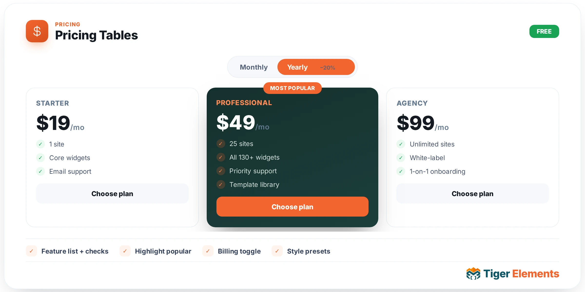
A single pricing-plan card — the boxed, feature-list style used across virtually every SaaS pricing page, gym membership site, and subscription service to present one distinct plan tier at a time. Unlike Price List’s flat, menu-style row format, this widget renders one complete, self-contained plan as its own card: badge, icon, title and subtitle, price, a feature list, and a call-to-action button, all packaged together as a unit you’d typically place several of side by side to build a full pricing comparison.
Building a plan card
A popular badge toggle with its own customizable text is the mechanism for visually nudging attention toward whichever plan you most want visitors to choose — a "Most Popular" or "Best Value" label that stands out from the surrounding cards, a proven pattern for guiding decision-making in a row of otherwise visually equal options. An icon at the top of the card and a title/subtitle pair identify the plan by name ("Pro", "Starter for freelancers"), followed by a currency-aware price with a configurable suffix field for framing the billing period — "/mo", "/year", "/user", whatever unit the price actually represents.
The features list
A repeater of feature-list rows is where the real comparison work happens for a visitor scanning between plans. Each row carries its own icon or checkmark styling and a bold-text option for emphasizing the specific features that matter most within that row — useful when a feature name itself needs visual weight beyond the plain description text around it ("Unlimited projects" rather than plain "Unlimited projects"). Because each row is independent, a plan’s feature list can mix included features, upgraded limits, and add-on capabilities all within the same repeater without needing separate widgets for each category of information.
Independent style sections
The card container, the badge, the icon, the price text, and the button each get their own dedicated style section rather than sharing one combined set of controls — meaning every visual piece of a plan card can be tuned independently. This matters in practice for the "popular" plan specifically, which typically needs a visually distinct treatment (a different border color, a slightly raised or scaled appearance, a bolder button) from the other plans sitting beside it — achievable by simply styling that one instance of the widget differently rather than needing a separate widget type just for the highlighted plan.
When to use Advanced Pricing instead
This widget renders exactly one fixed price per card — there’s no built-in monthly/annual toggle. For a pricing page that genuinely needs to switch between monthly and annual billing with all plans updating together, the Advanced Pricing widget handles that entire multi-plan, toggle-driven structure in a single widget instance instead of requiring separate Pricing Tables cards duplicated for each billing period.
Use it for
Any pricing page with a fixed, single-period price per plan — a one-time purchase tier structure, a subscription service billed on only one cadence, or a services business’s package tiers. Typically placed three or four across in a row, with the popular badge on whichever plan is meant to convert best.
Practical tips
- Give the popular plan’s card a genuinely distinct visual treatment, not just the badge text — a subtly elevated shadow, a different border color, or a slightly larger scale reinforces the badge’s message rather than leaving it as the only differentiator.
- Keep feature-list wording parallel across all plans in a comparison — if one plan says "Unlimited storage" and another says "50GB of storage space," inconsistent phrasing makes the actual comparison harder to scan than it needs to be.
- If billing period flexibility (monthly vs. annual) is genuinely needed, switch to Advanced Pricing rather than trying to build the toggle manually with multiple Pricing Tables instances and visibility conditions.