
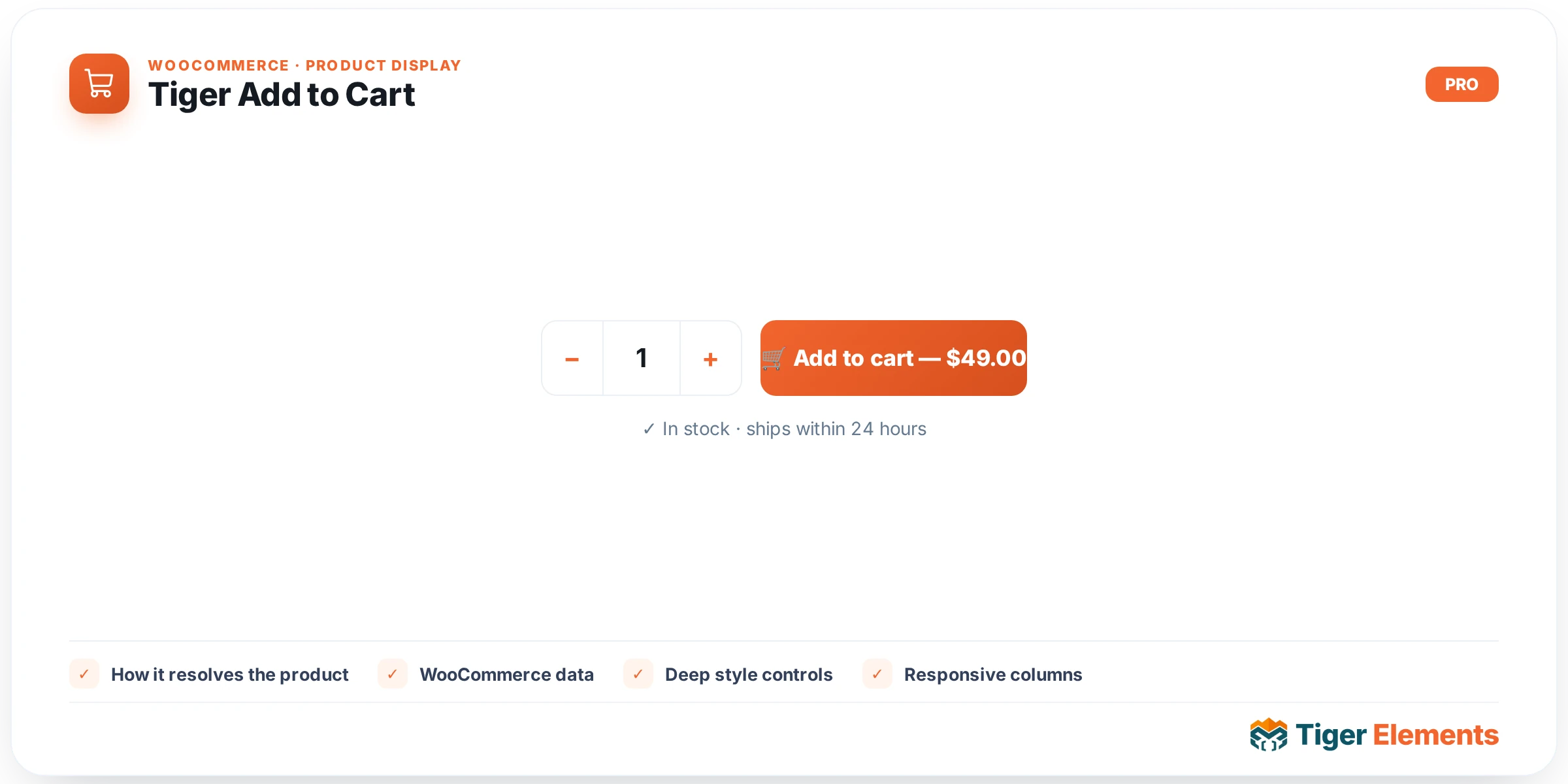
Tiger Add to Cart (widget key tiger_add_to_cart) is a dynamic WooCommerce add-to-cart widget for single-product templates and product loop/archive cards. Rather than building a custom cart form, it calls WooCommerce’s native woocommerce_template_single_add_to_cart() function, so variation selectors, grouped-product line items, stock validation, and quantity handling all behave exactly like WooCommerce core — the widget’s job is to wrap that native form in brand-scoped markup and expose an Elementor-Pro-grade Style panel over every part of it: the button (with Normal/Hover/Focus states), the quantity field including its spinners, and the variation selectors. It requires WooCommerce to be active and needs product context, and it is registered as dynamic content so it re-renders correctly per loop item.
How it resolves the product
Like its sibling Tiger Product Price, it checks a global $tiger_loop_post_id first (set when placed inside a Products Grid or Dynamic Loop card), falling back to get_the_ID() for single-product context. Before calling WooCommerce’s render function, it temporarily swaps $GLOBALS['product'] to the resolved product and restores the previous global immediately after — this is necessary because WooCommerce’s native add-to-cart template function reads the product from that global rather than accepting a parameter, and the swap-and-restore keeps this widget safe to nest inside loops without leaking state into surrounding code.
Setting it up in Elementor
The Content section, labeled “Add to Cart,” has three controls. “Button Text (simple products)” is a dynamic-tag-enabled text field (placeholder “Add to cart”) whose description states plainly what it does: it overrides the label only for simple products, while variable and grouped products keep their native WooCommerce labels (e.g. “Select options,” “Add to cart” for grouped) — this is enforced in code via a scoped woocommerce_product_single_add_to_cart_text filter that’s added right before render and removed right after, so it can’t bleed into other add-to-cart forms on the same page. “Show Quantity Field” is a switcher, on by default, that hides the quantity input via CSS (adds a tg-atc--noqty class that sets .quantity { display: none !important; }) rather than omitting it from the DOM — the field is still rendered by WooCommerce, just visually hidden. “Full-Width Button” is a switcher (default off) that stretches the button to 100% width and centers its text.
The Style tab has four sections. Layout covers the outer form: a responsive “Alignment” choose control (Left/Center/Right/Stretch, mapped to flexbox justify-content values flex-start/center/flex-end/stretch), a responsive “Gap (Qty ↔ Button)” slider, and a responsive “Margin” on the outer wrapper. Button covers Typography, Padding, Border Radius, Min Width, and a “Transition (ms)” slider (default 250ms) for hover animation timing, then splits into three state tabs: Normal (Text Color, Background with classic/gradient support, Border, Box Shadow), Hover (Text Color, Background, Border Color, Box Shadow, and a “Lift on Hover (px)” slider that translates the button upward on hover), and Focus (a single “Focus Ring Color” control, described in the code as an accessible keyboard focus outline applied via :focus-visible). Quantity Field (only shown when “Show Quantity Field” is enabled) covers Typography, Text Color, Background, Border, Border Radius, Padding, Width, and Height for the numeric input. Variations (variable products) covers the attribute label text (color + typography for the <th>/label elements), the attribute dropdown (color, background, border, radius, padding), and a dedicated “Variation Price Color” control for the price shown once a variation is selected.
Non-obvious behavior
Because “Show Quantity Field” hides the field with CSS rather than removing it from the form, disabling it doesn’t change how WooCommerce processes the add-to-cart submission — the quantity value (defaulting to 1) is still submitted, it’s just not user-editable in the UI. The Focus tab exists specifically for accessibility and only styles the outline shown during keyboard navigation (:focus-visible), not mouse clicks — don’t expect it to show on a mouse click alone. In the editor, if WooCommerce isn’t active it shows “WooCommerce is not active.” as a placeholder; if no product can be resolved it shows a plain, unstyled “Add to cart” button purely so there’s something visible to select and style — neither placeholder appears on the live site.
When to use it vs. related widgets
Use Tiger Add to Cart when you need the real, functioning WooCommerce cart form — including variation selection and stock-aware validation — as an independently placed, independently styled element, such as building a custom single-product layout piece by piece. It pairs naturally with Tiger Product Price in that scenario. It is not the same as the Add to Cart button baked into Products Grid cards, which is a simplified AJAX button for simple-product loop cards (no variation selector); if your grid sells variable products and needs the full selection form per card, this widget is the more correct choice than relying on the grid’s built-in button.
Practical tips
- If a custom button-text override isn’t showing for a variable product, that’s expected — the “Button Text” control only affects simple products by design; variable/grouped labels come straight from WooCommerce.
- Style the Focus Ring Color even if you don’t think it matters visually — it’s the only accessibility-specific control here and costs nothing to set to something visible.
- When nesting this widget inside a loop/grid card, don’t also enable a separate cart button in the card settings for the same product — you’ll end up with two functional add-to-cart controls stacked on one card.
- Use “Full-Width Button” combined with “Show Quantity Field” off for a clean, single full-width CTA in narrow card layouts where a quantity stepper would crowd the design.