
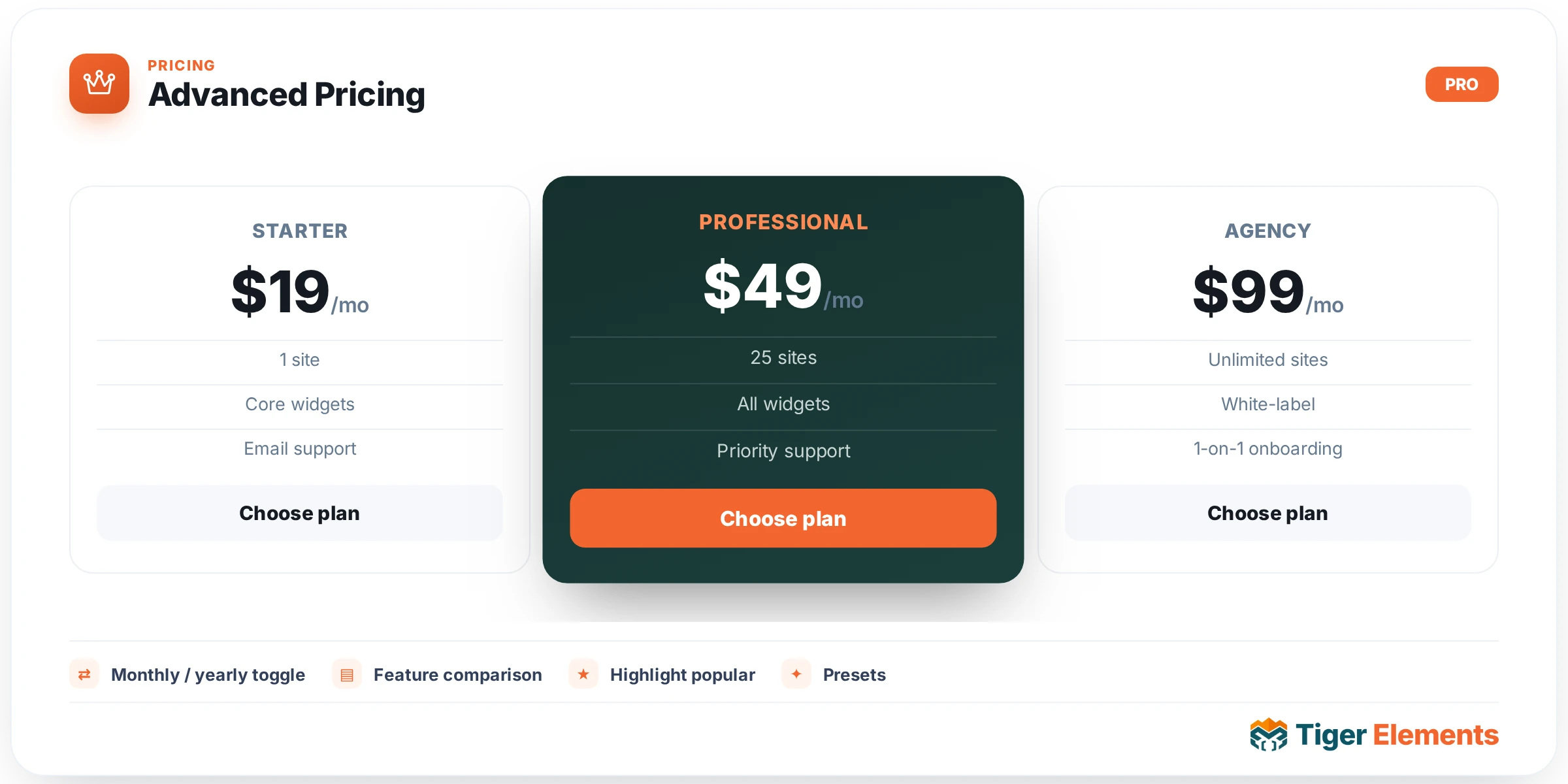
A full pricing-table widget with a built-in Monthly / Annually billing toggle switch — complete with a customizable savings badge, typically something like "Save 20%" — and multiple plans rendered from a single widget instance, rather than needing one Pricing Tables widget duplicated per plan and manually kept in sync between two billing-period versions of the same page.
Why this exists separately from Pricing Tables
The plain Pricing Tables widget renders one fixed price per card with no built-in period switching, which works perfectly well for a single-cadence pricing structure. The moment a business wants to offer both monthly and annual billing on the same page — genuinely common practice, since annual billing typically carries a discount that incentivizes longer commitment — building that with separate widgets means either two entirely separate sets of pricing cards (one visible at a time via manual visibility conditions) or accepting a page that only shows one billing period at all. Advanced Pricing solves this directly: one widget, one toggle, every plan’s displayed price updates in sync the instant a visitor switches between Monthly and Annually.
Building the plans
Each entry in the pricing plans repeater carries its own monthly price and its own annual price as two separate fields — not a single price with a calculated discount, but two genuine, independently set values, which matters because real annual-discount math doesn’t always work out to a clean round percentage, and this structure lets you set the exact number you actually want to charge rather than relying on an automatic calculation. Each plan also carries its own feature list and an optional "highlighted" badge, the same popular-plan mechanism the simpler Pricing Tables widget offers, working identically here across whichever plan deserves the extra visual attention.
Layout and styling
Layout columns control how many plans display side by side — the same responsive column count decision as any multi-item grid widget, typically three or four depending on how many tiers the pricing structure actually has. Dedicated style sections cover the card container, plan typography, buttons, the toggle switch itself, and badges — meaning the billing-period toggle’s own visual design (its track, its active-state color, the savings badge next to it) is just as fully customizable as every other piece of the widget, not a fixed, unstyleable control bolted onto an otherwise designed page.
Use it for
Any subscription or SaaS-style pricing page offering both monthly and annual billing, which describes the large majority of modern subscription businesses. It’s the natural default choice over the simpler Pricing Tables widget whenever billing-period choice is part of the actual pricing strategy, since building that toggle behavior manually with the simpler widget would mean duplicating every plan card and managing their visibility by hand.
Practical tips
- Set the savings badge’s percentage to genuinely reflect the real difference between your monthly and annual prices — a mismatched claimed discount that doesn’t match the actual math undermines trust the moment a visitor does the arithmetic themselves.
- Default the toggle to whichever billing period you actually want most customers choosing — many businesses default to Annually specifically because that’s the more profitable and stickier commitment, using the toggle’s starting state as a gentle nudge.
- Keep the highlighted plan consistent regardless of which billing period is selected — switching which plan is marked "most popular" between Monthly and Annually views would read as confusing rather than helpful.