
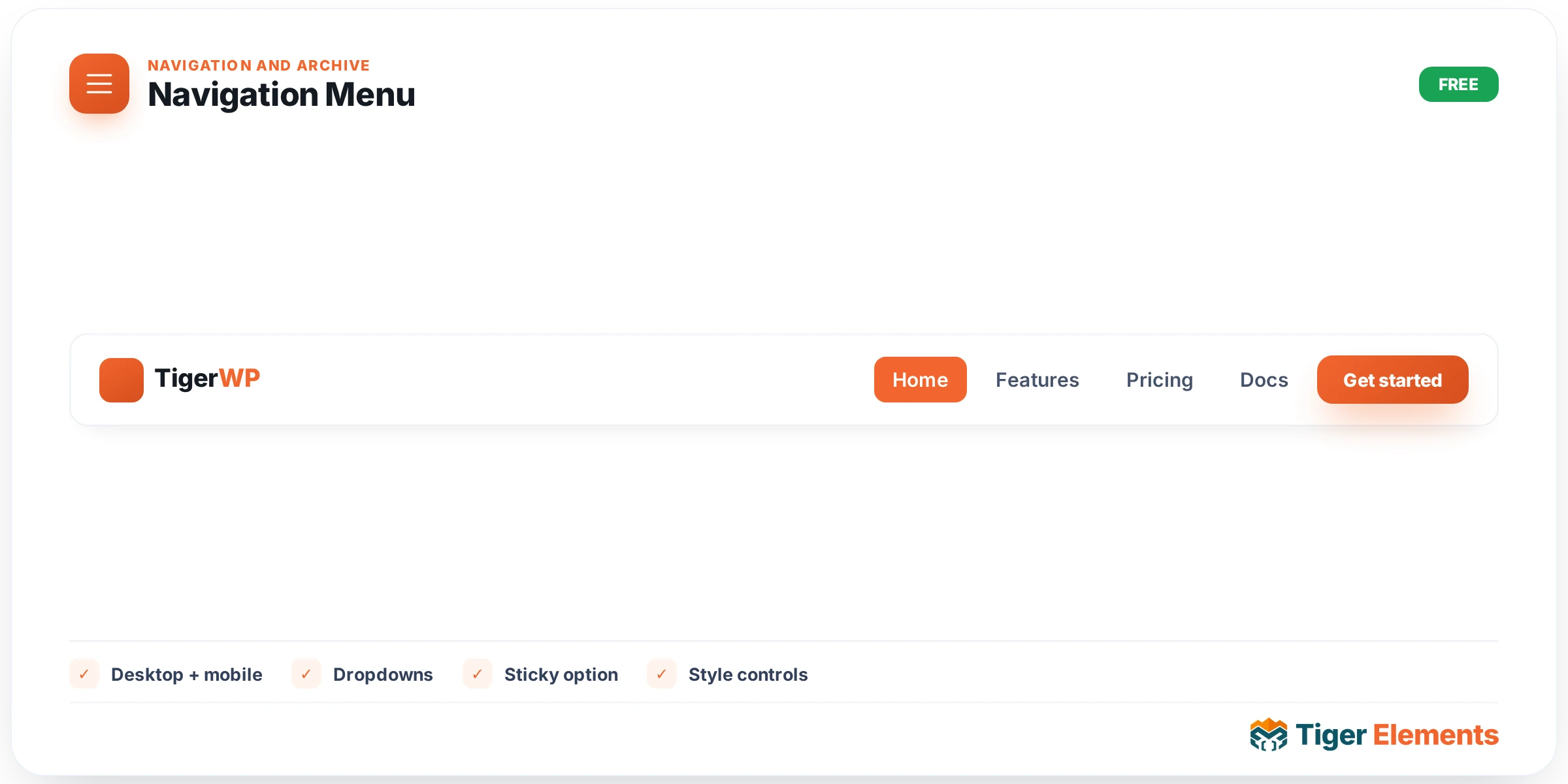
Renders a standard WordPress menu with Tiger’s own dropdown and mobile behavior, styled entirely through Elementor controls rather than inherited from the active theme’s built-in menu CSS. This distinction matters more than it might first appear: a theme’s default navigation menu markup and styling is written by that theme’s author for that theme’s own visual language, which means it frequently looks inconsistent — subtly or obviously — with the rest of a page built using Tiger Elements widgets. This widget exists specifically to remove that dependency, giving the header navigation full, independent design control regardless of which theme happens to be active underneath it.
Choosing the source menu
The widget doesn’t invent its own menu structure — it renders any menu already created under Appearance → Menus, the same place WordPress manages navigation everywhere else on the site. This keeps menu-item management centralized in one familiar place rather than duplicating link structures across multiple systems, and it means an existing, already-configured menu can be immediately handed to this widget without needing to rebuild anything from scratch.
Dropdown behavior
The Dropdown Settings section controls how submenus reveal themselves, with a choice between hover and click as the trigger. Hover suits desktop-first sites where a visitor’s mouse naturally reveals the submenu the moment it passes over a parent item — fast, and requires no extra interaction. Click, by contrast, is generally the friendlier and more accessible option, particularly for touch-screen visitors where a hover state doesn’t meaningfully exist, and for keyboard/assistive-technology users who benefit from an explicit, deliberate trigger rather than an accidental hover reveal. Many sites end up choosing click specifically for that accessibility reason even on primarily desktop traffic, since it removes any ambiguity about whether a submenu is intentionally open.
Mobile behavior
Mobile Settings defines the responsive breakpoint at which the menu switches from its full horizontal desktop layout into the off-canvas mobile panel — the slide-out drawer pattern visitors expect on a phone-sized screen. That mobile trigger, typically a hamburger icon, gets its own dedicated style states (Normal and Hover), so it can be visually tuned to match the rest of the header’s design rather than looking like a generic, unstyled default icon dropped into an otherwise polished page.
Why this widget over a theme’s built-in menu
Beyond pure visual consistency, using this widget rather than a theme-provided menu keeps the entire header — logo, navigation, any header widgets — under one coherent Elementor-controlled design system. That matters especially on a Theme Builder header template, where the goal is typically a header that looks and behaves identically regardless of which theme is active behind the scenes; relying on a theme’s own menu styling would undermine that goal the moment the theme changes or gets updated in a way that alters its default menu appearance.
Use it for
This is the default choice for any header’s primary navigation built with Tiger Elements, and especially important inside a Theme Builder header template intended to be theme-independent. It’s less necessary for a one-off page where a simple, non-dropdown link list would suffice — in that narrower case a plainer navigation approach may be simpler than configuring this widget’s full dropdown and mobile behavior.
Practical tips
- Choose click over hover for the dropdown trigger unless you have a specific, deliberate reason for hover behavior — it tends to be the more broadly accessible and touch-friendly default.
- Set the mobile breakpoint to match wherever the rest of your header layout actually starts feeling cramped, rather than a generic device-width assumption — the right switch point depends on how much content (logo width, number of menu items) the header carries.
- Style the hamburger icon’s Hover state distinctly from Normal, even subtly — it’s a small detail that signals the icon is genuinely interactive rather than decorative.