
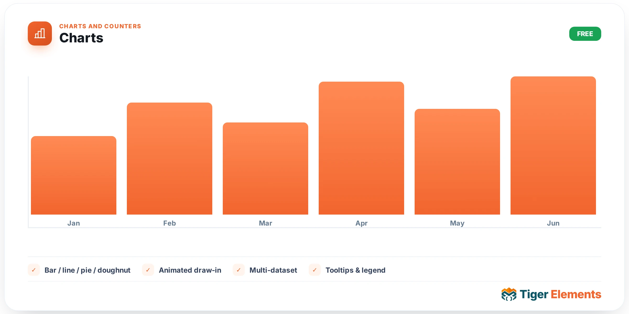
Charts is Tiger Elements’ answer to the fact that most Elementor add-on suites either ship no data-visualization widget at all, or ship one that pulls in Chart.js as an external dependency and renders it in a way that’s hard to restyle. Tiger’s version does neither: it draws everything as pure inline SVG, generated client-side by the enqueued tiger-charts-script, with zero third-party charting libraries loaded on the page. That keeps the footprint tiny and means every visual element — bars, lines, grid, legend, labels — inherits your site’s actual colors and typography rather than a library’s default look, because the widget passes its whole configuration as a sanitized JSON payload in data attributes and lets the script own the (responsive, animated) drawing.
The widget supports five chart types, chosen from the Type control in the Chart content section using Elementor’s icon-toggle (CHOOSE) control: Bar, Line, Area, Pie, and Doughnut. There is no “column,” “radar,” “scatter,” or “bubble” option — those five are genuinely the full set baked into the code, so don’t promise clients chart types the widget doesn’t have. Below the type selector sits an optional Chart Title field (supports dynamic tags) and then the real heart of the widget: the Data repeater. Each row has a Label, a Value (numeric), an optional Value (Series B) field used only for comparison mode, and an optional Colour (optional) swatch that overrides the palette for that specific point or pie slice. Five example rows (Jan through May, with both a primary and a “Series B” value) ship as defaults so the chart renders something sensible the moment you drag it onto the canvas.
Comparing two data series
Flip the Compare two series switcher and the widget draws the “Value (Series B)” column from every row as a second dataset — grouped bars sitting beside the first, or a second line/area layered on top, depending on chart type. This unlocks three more controls: Series A name and Series B name (used in the legend and tooltip) and Series A colour / Series B colour, which fall back to the first and second palette swatches if left blank. It’s worth calling out explicitly that comparison mode is not applied to Pie or Doughnut — those chart types only ever visualize a single value per slice, so the Series B field is simply ignored when either is selected.
Display and styling controls
The Display section (still content tab) governs the chart’s chrome: a responsive Height slider (150–800px or 10–100vh), a Legend switcher with Legend Position (Top/Bottom) and a responsive Legend Alignment choose-control (Left/Center/Right), a Value Labels switcher, a Grid & Axis switcher that only appears for Bar/Line/Area (pie shapes have no axes), an Hover Tooltip switcher, Value Prefix / Value Suffix text fields (handy for “$” or “%”), a Grid Divisions number control (2–10, default 4) for how many horizontal gridlines appear, and an Animate on Scroll switcher paired with an Animation Duration (ms) slider (200–3000ms) so the chart draws itself in as it enters the viewport rather than popping in fully formed.
On the Style tab you get a full Chart Container section (background, padding, border radius, border, and box-shadow group controls, all standard Elementor group controls), then a Palette section with six standalone color swatches — Colour 1 through Colour 6, defaulting to an orange/blue/green/yellow/purple/red set. The rendering script cycles through these whenever a data point has no explicit override color; pie, doughnut, and bar charts assign one per point/slice, while line and area charts use the first swatch as their single series color. Alongside the palette sit type-conditional sliders: Area / Fill Opacity and Line / Bar Stroke (line/area only), Bar Corner Radius and Bar Width (%) (bar only), Point Size (line/area only), and Doughnut Thickness (%) (doughnut only). Finally, Title, Axis & Legend gives you color and typography group controls for the chart title, grid lines, axis labels, value label color, and legend text.
Practical tips
- If a chart isn’t appearing at all, check the Data repeater first — the render function bails out completely with no fallback markup when the data_points array is empty, so an accidentally-cleared repeater produces a blank space, not an error.
- Use Value Prefix/Suffix instead of typing currency symbols into the Label or Value fields directly; the underlying value stays numeric for tooltip math and animation easing, while the symbol is layered on purely for display.
- When building a revenue-vs-target comparison, set explicit Series A/B colours rather than relying on the palette fallback — the palette is shared with single-series pie/bar rendering elsewhere on the page, and an explicit pick avoids two unrelated charts on the same page accidentally looking like a matched pair.
- For dashboards with several charts stacked vertically, turn off Animate on Scroll on all but the first one, or stagger the Animation Duration values — several charts drawing in simultaneously on scroll can feel busier than a single clean reveal.