
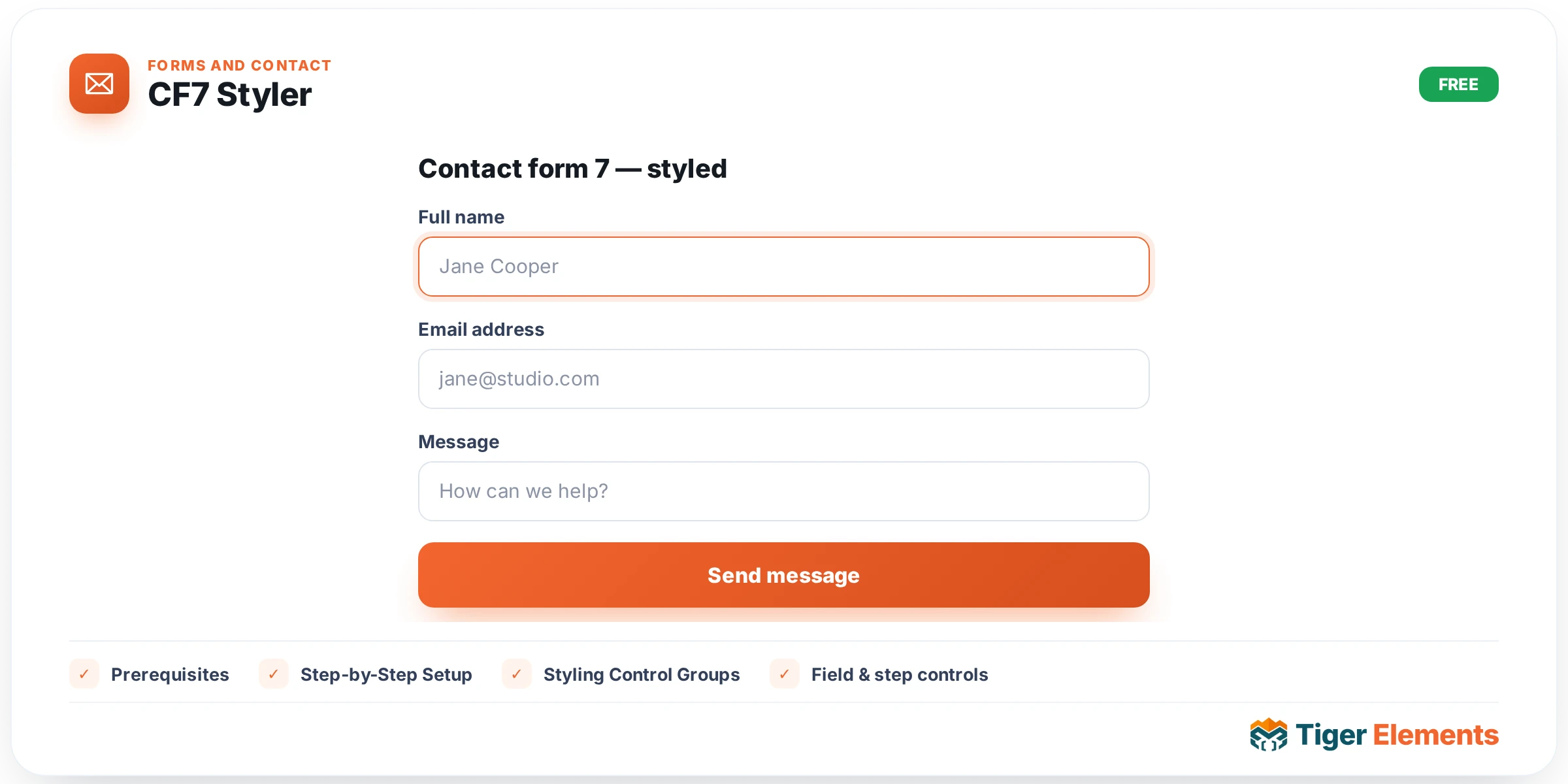
What the Tiger CF7 Styler Widget Does
Tiger CF7 Styler is a free Elementor widget bundled with Tiger Elements that lets you take any form you have already built in Contact Form 7 and restyle it entirely with Elementor controls. Instead of writing custom CSS to override Contact Form 7’s default markup, you drop this widget onto your page, pick the form you want from a dropdown, and then use a full set of Style-tab panels to control the container, labels, inputs, checkboxes and radios, the submit button, and the validation/response messages. The widget does not talk to any external API and needs no license key or API credentials — it is purely a presentation layer that sits in front of a form Contact Form 7 already renders, using the shortcode Error: Contact form not found.
Prerequisites
- Contact Form 7 must be installed and active. The widget checks for the
wpcf7_contact_formpost type before it will list anything to style. - At least one Contact Form 7 form must already exist (published) in your site, since the widget only styles forms you have built in CF7 — it does not create form fields itself.
- You need Elementor with Tiger Elements active, as with any other Tiger widget.
Step-by-Step Setup
- Create your form in Contact Form 7 first. Go to Contact > Add New in the WordPress admin and build the fields you need (name, email, message, checkboxes, and so on). Publish it and note its title.
- Add the widget to your page. Open the page in Elementor, search the widget panel for “Tiger CF7 Styler,” and drag it into the section where you want the form to appear.
- Select your form. In the widget’s Content tab, under the “Contact Form” section, use the “Select Form” dropdown. This list is built dynamically from every published Contact Form 7 form on your site, showing each form’s title. Choose the one you want to display.
- Style it. Switch to the Style tab and work through the panels described below — Form Container, Labels, Input & Textarea, Checkbox & Radio, Submit Button, and Validation & Messages — to match the form to your design.
- Publish and test. Preview the page, submit a test entry, and confirm the success and error states look right.
If Contact Form 7 is not installed or active, the “Select Form” dropdown will only show its placeholder option (“Select a Form”) with nothing to pick, because the widget’s form lookup checks whether the wpcf7_contact_form post type exists before querying for forms — with the plugin inactive, it simply returns an empty list rather than throwing an error. The same happens if CF7 is active but you have not created any forms yet: the dropdown stays empty aside from the placeholder. In either case, until you select a form, the widget renders a placeholder message on the front end reading “Please select a Contact Form 7 from the widget settings,” so you always get a clear, visible cue instead of a blank space or a broken layout.
Styling Control Groups
Form Container — controls padding around the whole form, a background (solid color or gradient), a full border group, and border radius, all applied to the outer .wpcf7 element.
Labels — typography, label color, and a “Spacing Bottom” control that adds space beneath each label and pushes the field below it down to match.
Input & Textarea — this is the largest panel. It covers width and height sliders, bottom margin, and full typography for text, email, tel, url, number, and date inputs, textareas, and selects. A Normal/Focus tab pair lets you set text color, background color, border (with a border-radius control) for the resting state, and a separate text color, background color, and border color for the focused state, where the border color also drives the outline/box-shadow glow. Below the tabs there is a dedicated Placeholder color control and a Textarea Height slider that sets the minimum height and enables vertical resizing.
Checkbox & Radio — an “Accent Color” control that recolors the native checked state (the checkmark or radio dot) in modern browsers, an “Input Size” slider, and a “Gap Between Input & Text” spacing control. A Layout sub-group offers an “Item Layout” choice (Inline / Side by Side vs. Block / Stacked), a “Margin Between Items” slider, and typography plus color controls for the option labels.
Submit Button — button alignment (left/center/right), width, typography, and padding, followed by Normal/Hover tabs. Each tab sets text color, background color, a border group, and border radius, so you can define both the resting look and the hover look of the submit button independently.
Validation & Messages — three color controls: error text color for the small “not valid” hints under invalid fields, a success message color that styles the border, text, and background of the response box when the form is sent successfully, and a failed-message color that styles the response box for invalid, unaccepted, or failed submissions.
Practical Tips and Troubleshooting
- Nothing changes after you style the form: double-check you actually selected a form in the “Select Form” dropdown — until a form ID is chosen, the widget only shows the “Please select a Contact Form 7” placeholder, and none of the Style-tab CSS has anything to attach to.
- Styles look right in the editor but not on the live page: Elementor and browsers both cache generated CSS. Regenerate the widget’s CSS via Elementor’s Tools > Regenerate Files, then hard-refresh (or clear any page/CDN cache) so the updated selectors reload.
- A field type isn’t picking up the Input & Textarea styling: the shared selectors target specific input types (text, email, tel, url, number, date), textareas, and selects. Field types outside that list, or third-party CF7 add-on fields with different markup, may need their own custom CSS.
- Checkbox/radio colors look unchanged: the accent-color property that recolors the checked state depends on browser support; very old browsers will keep the native control appearance regardless of the value you set.