
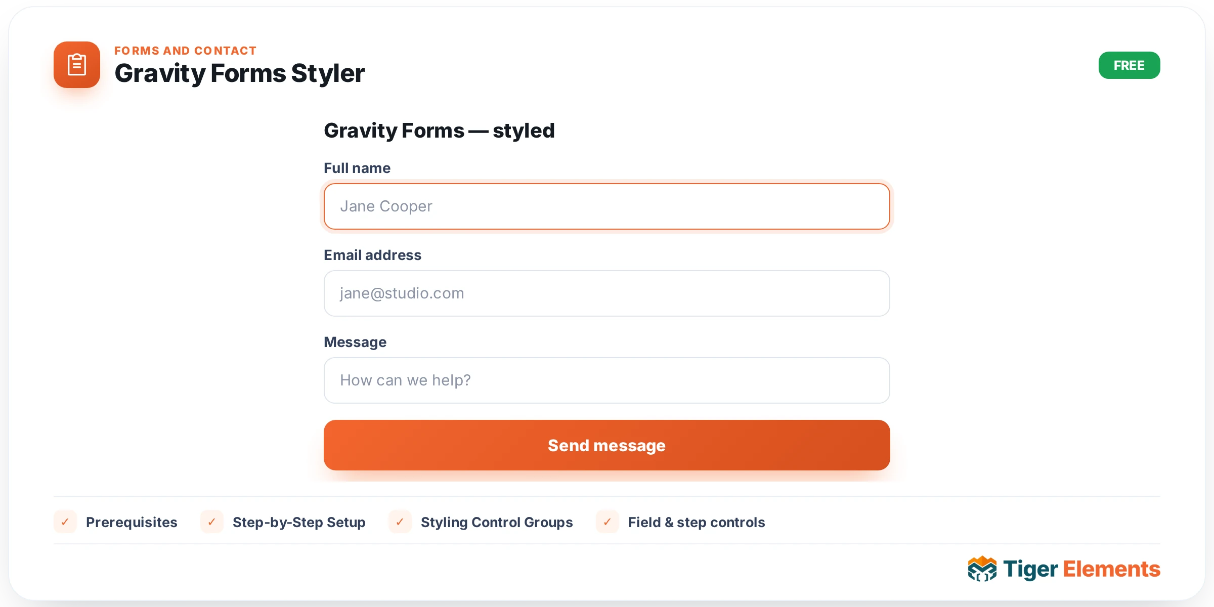
What the Gravity Forms Styler Does
The Tiger Gravity Forms Styler is a free Elementor widget included with Tiger Elements. It does not build forms itself — instead it lets you drop an existing Gravity Forms form onto any Elementor page and then restyle every visual part of that form (container, title, description, labels, inputs, checkboxes and radios, the submit button, and validation messages) using native Elementor controls, without writing custom CSS. Under the hood the widget simply outputs the standard [gravityform] shortcode inside a wrapper element (.tg-gf-wrap) and layers a large set of scoped selectors on top, so the form keeps all of its Gravity Forms functionality (multi-step logic, conditional fields, notifications, AJAX submission) while inheriting a design that matches your site.
Prerequisites
- Gravity Forms must be installed and active. Gravity Forms is a separate, paid third-party plugin from Rocketgenius — it is not part of Tiger Elements and must be purchased and licensed independently. Tiger Elements only detects and styles forms that already exist; it does not include or bundle Gravity Forms in any way.
- At least one form must already be created in the Gravity Forms admin (Forms → New Form) before it can be selected in the widget, since the widget’s form dropdown is populated dynamically from your existing forms.
- Elementor (free or Pro) must be active, as with any Tiger Elements widget.
Step-by-Step Setup
- Create your form first. In WP Admin, go to Forms and build the Gravity Form you want to display (fields, notifications, confirmations, multi-page logic, etc.). This step happens entirely inside Gravity Forms — Tiger Elements does not create or edit form fields.
- Open the page in Elementor and search the widget panel for “Tiger Gravity Forms Styler.” Drag it onto the page like any other widget.
- Go to the Content tab, “Gravity Form” section, and use the “Select Form” dropdown to choose the form you created. This dropdown is built from
GFAPI::get_forms(), so every published Gravity Form on the site appears there by title. - Toggle “Display Title” and “Display Description” if you want the form’s built-in title/description shown above the fields, and leave “Enable AJAX” on (its default) for a smoother, no-page-reload submission experience — or turn it off if you rely on a redirect-based confirmation.
- Switch to the Style tab and work through the six style sections described below to match the form to your page design.
If you drag the widget onto a page before selecting a form, the frontend simply shows a placeholder message: “Please select a Gravity Form from the widget settings.” And if Gravity Forms itself is not installed or active on the site, the widget detects the missing GFAPI class and instead outputs “Gravity Forms is not installed or active.” — so the page never breaks or throws a fatal error, it just tells you what’s missing.
Styling Control Groups
All styling lives in six sections under the Style tab. Every selector targets classes inside the widget’s own .tg-gf-wrap wrapper, and the widget accounts for both legacy Gravity Forms markup (pre-2.5, ul/li based) and the modern 2.5+ “gravity-theme” markup, so styles apply consistently regardless of which Gravity Forms version generated the HTML.
- Form Container — Field Spacing (Bottom), Container Padding, a Background group (classic or gradient), a Border group, Border Radius, and a Box Shadow group, all applied to the
.gform_wrapperelement. - Title & Description — Alignment (left/center/right) for the title, description and heading; a separate Color and Typography group for the Title; and a separate Color, Typography group and Margin for the Description.
- Labels — Typography and Color for field labels (
.gfield_label), Spacing Bottom below each label, plus a dedicated “Required Marker” subgroup with its own Color and Size controls for the asterisk shown on required fields. - Input & Textarea — Width, Height, Padding and Typography for all text-type inputs, textareas and selects, with separate “Normal” and “Focus” state tabs (Text Color, Background Color, and — on Focus — Border Color with an outline/box-shadow effect). It also includes an Input Border group, Input Border Radius, a Placeholder Color control, and a Textarea Height slider.
- Checkbox & Radio — Accent Color for the checked state, Input Size, Gap Between Input & Text, an Item Layout choice (Inline “side by side” vs Block “stacked”), Margin Between Items, and Label Typography/Color for the choice text next to each checkbox or radio button.
- Submit Button — Button Alignment, Width, Typography, Padding, and separate Normal/Hover tabs each with Text Color, Background Color, a Border group (Border Radius on Normal), and a Box Shadow group. The same selectors also cover the multi-page Next/Previous navigation buttons (
.gform_next_button/.gform_previous_button), so paginated forms get consistent button styling automatically. - Validation & Messages — Errored Field Border color (applied to any field flagged with
.gfield_error), Error Message Color for the inline validation text under a field, Validation Summary Border/Text color for the top-of-form error summary box, and Confirmation Border/Text color for the success/confirmation message box.
Practical Tips / Troubleshooting
- Nothing shows on the page? Check two things in order: that a form is actually selected in “Select Form,” and that Gravity Forms is active — the widget will tell you exactly which of these is missing via its placeholder text, so read the message before assuming it’s a bug.
- New form not appearing in the dropdown? The list is pulled live from Gravity Forms each time you open the panel, so simply re-save or reload the Elementor editor after creating the form in Forms → New Form.
- Multi-step forms: because the Submit Button section’s selectors also match
.gform_next_buttonand.gform_previous_button, styling the submit button automatically styles page-navigation buttons too — you don’t need a separate control group for paginated forms. - Errored fields not turning red? The Errored Field Border color uses
!importantto override Gravity Forms’ own error styling, so if a custom theme or another plugin is still winning, double-check for even higher-specificity CSS elsewhere rather than assuming the widget control isn’t working.