
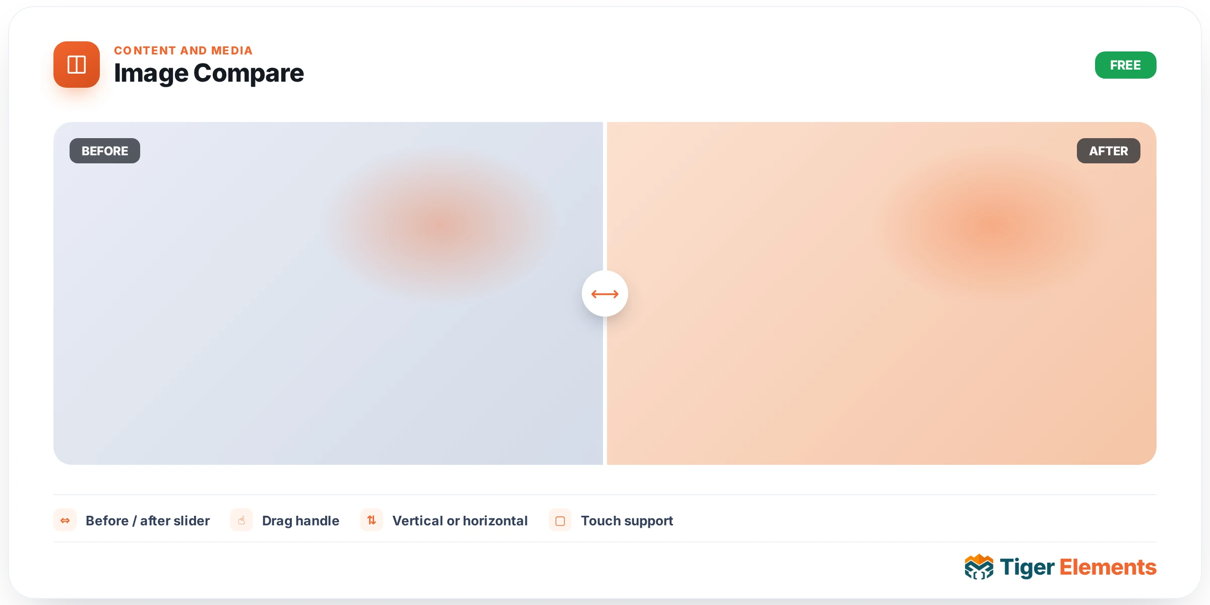
A before/after image slider — a draggable divider that reveals the difference between two images, the interaction pattern behind countless renovation showcases, photo-editing demonstrations, and product-comparison visuals across the web. It’s one of the most immediately intuitive ways to demonstrate a genuine transformation, because the visitor controls the reveal themselves by dragging, rather than passively watching an automatic before/after animation play out on its own schedule.
Setting up the comparison
Two images are all this widget fundamentally needs — a "before" and an "after" — with the draggable divider sitting between them, initially positioned somewhere the visitor can immediately grab and move. Optional title and subtitle overlays can be added to each side independently, useful for labeling exactly what’s being compared ("Before renovation" / "After renovation", or specific product names for a comparison between two options) rather than relying on the visitor to infer which side is which purely from visual context.
Sizing and positioning
A responsive widget height control (set in either pixels or viewport height units) determines how tall the comparison area renders across different screen sizes, and an image position control fine-tunes how each image is cropped or aligned within that fixed-height container when the source images don’t share identical dimensions or aspect ratios — a common real-world situation since a genuine before/after photo pair is rarely captured at pixel-identical framing.
Why this beats a static side-by-side comparison
A conventional side-by-side layout — before image on the left, after image on the right — technically shows the same information, but it requires a visitor to mentally hold one image in memory while scanning to the other, comparing details across a physical gap on the page. This widget instead overlays both images in the exact same space, letting the visitor slide directly between them and see precisely what changed at any specific point in the frame, which is a meaningfully more effective way to demonstrate detail-level transformation than a side-by-side layout can offer.
Use it for
Home renovation and remodeling portfolios (the single most common application), photo retouching or editing service demonstrations, real estate before/after staging comparisons, and any product comparison where two visually similar options genuinely benefit from a direct, draggable overlay rather than being shown as separate static images.
Practical tips
- Use image pairs captured from the same angle and framing wherever possible — a before/after pair shot from noticeably different positions or distances undermines the comparison, since differences in framing can be mistaken for the actual change being demonstrated.
- Add title/subtitle labels whenever the two images aren’t immediately obvious from visual context alone — a comparison between two similar-looking product variants, for instance, benefits far more from explicit labeling than a clearly dramatic renovation before/after would.
- Set the widget height generously enough that fine detail in both images remains visible — a comparison squeezed into too short a container makes the actual differences harder to appreciate, undermining the whole point of the interactive slider.
Requirements and technical notes
The widget works with any two images uploaded through the Media Library — there’s no dependency on WooCommerce or any other Tiger Elements module, so it’s available on the free tier and works in any layout, including inside a Theme Builder section or a popup. Because the divider interaction is drag-based, it works naturally on both desktop (mouse drag) and mobile (touch drag) without any separate configuration for each input type.
Performance-wise, both images load as normal responsive images rather than through any special lazy-loading or progressive-reveal mechanism, so standard image-optimization practices — appropriately sized source files, modern formats like WebP — apply here the same as anywhere else on the page.