
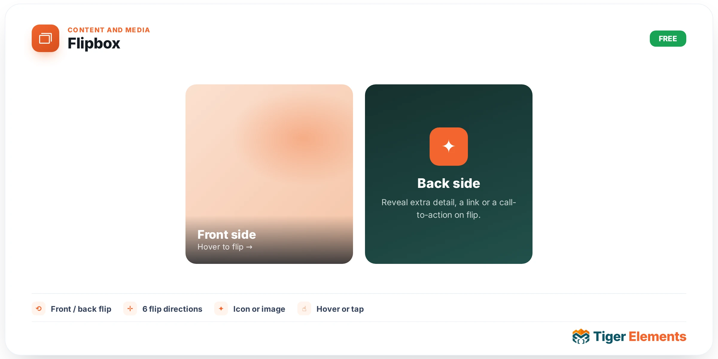
A card that flips to reveal a second side on hover, or on tap for touch devices — a front face and a back face, each carrying its own icon, title, subtitle, description, and button, effectively giving you two complete card layouts packed into the same footprint. Where a plain card can only ever show one state of information at a time, Flipbox lets you lead with a short, intriguing teaser on the front and reserve the fuller explanation for the moment a visitor actually engages with it.
Designing the two faces
Both the front and back sides are configured independently, each with the full set of content fields — icon, title, subtitle, description text, and a button. This independence is what makes the widget genuinely useful rather than just a novelty: the front can be deliberately minimal (an icon and a short, punchy title designed to invite curiosity) while the back carries the actual substance (a fuller description and a call-to-action button), or the two sides can be structured as a genuine before/after or question/answer pair, each equally weighted.
Tuning the flip mechanics
Flip effect and effect direction together decide the physical motion of the transition — which axis the card appears to rotate around and which direction it flips, options that range from a classic horizontal card-flip to a vertical flip or corner-fold style effect depending on what’s available in the effect library. A transition duration slider tunes how quickly or slowly that flip plays out; a snappier, faster flip feels energetic and immediate, while a slower one gives the motion more visual weight and lets a visitor genuinely watch the card turn rather than perceiving it as an instant swap.
Minimum height is a small but practically important control: it keeps every Flipbox in a grid sized consistently even when the front and back content don’t naturally occupy the same amount of space. Without a shared minimum height, a row of Flipbox cards with uneven content lengths would produce a visually jagged grid where some cards are noticeably taller or shorter than their neighbors — setting this control keeps the whole row aligned regardless of how much text each side actually contains.
Use it for
"Hover to learn more" feature cards are the clearest fit — a service or product benefit teased on the front, with the fuller explanation and a CTA revealed on the back once a visitor’s cursor lingers. A team-member card variant works well too, showing a photo and name on the front with a short bio and social links revealed on the back. Comparison-style content — a "the problem" front paired with "our solution" back — is another natural pattern that leans directly into the flip’s inherent two-state structure.
Practical tips
- Keep front-side content genuinely minimal — the whole appeal of a flip card is the moment of reveal, and a front side that already contains most of the information removes the incentive to interact with it at all.
- Remember that hover-based interaction doesn’t exist the same way on touch devices — check how the flip behaves on tap for mobile visitors, since a hover-only implementation would leave the back side effectively inaccessible without a cursor.
- Set Minimum Height deliberately once real content is in place, rather than relying on the default — content length varies enough between individual cards that a shared height genuinely needs checking against your actual copy.