
Overview
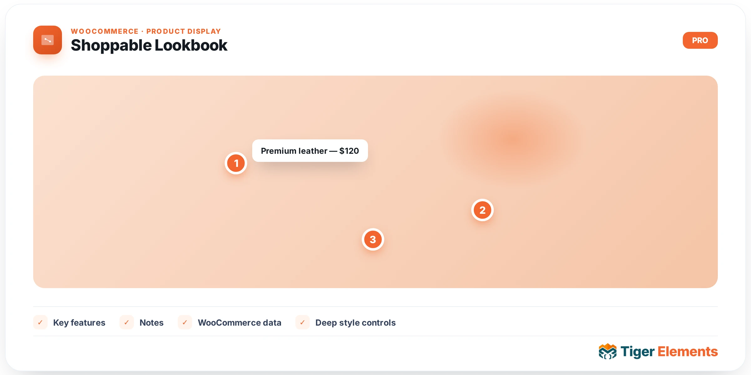
Shoppable Lookbook turns any image into an interactive, shoppable scene. You place hotspot markers anywhere on the image and each one opens a mini card — either custom content you write, or a live WooCommerce product with an inline “Add to cart”.
Key features
- Positioned hotspots — drop markers by X/Y percentage; a pulsing animation draws the eye.
- Two card modes — Custom Content (thumbnail, title, description, price, badge, button) or WooCommerce Product (product image, title, price and an inline add-to-cart).
- Smart popovers — cards flip to whichever side has room so they never spill off the image edge; one opens at a time; outside-click and Esc close them.
- Hover or click — choose the trigger; touch devices always use tap. Optionally open the first card on load.
Setting it up
- Add the Shoppable Lookbook widget and choose your image under Content → Lookbook Image.
- Under Content → Hotspots, add a row per marker; set its X/Y position and pick Custom Content or WooCommerce Product.
- For product hotspots, pick the product; for content hotspots, fill in the card fields.
- Pick the trigger (hover / click) under Behaviour.
- Style the marker, card, button and open animation on the Style tab.
Notes
- Product mode requires WooCommerce. If WooCommerce is inactive or a product can’t be found, that hotspot falls back to its custom-content fields, so the widget never breaks.
- Add-to-cart on product cards uses WooCommerce’s own AJAX add-to-cart, so it works with your existing cart and mini-cart.
Availability
Shoppable Lookbook is a Pro widget. Enable or disable it under Tiger Elements → Widgets.