
Overview
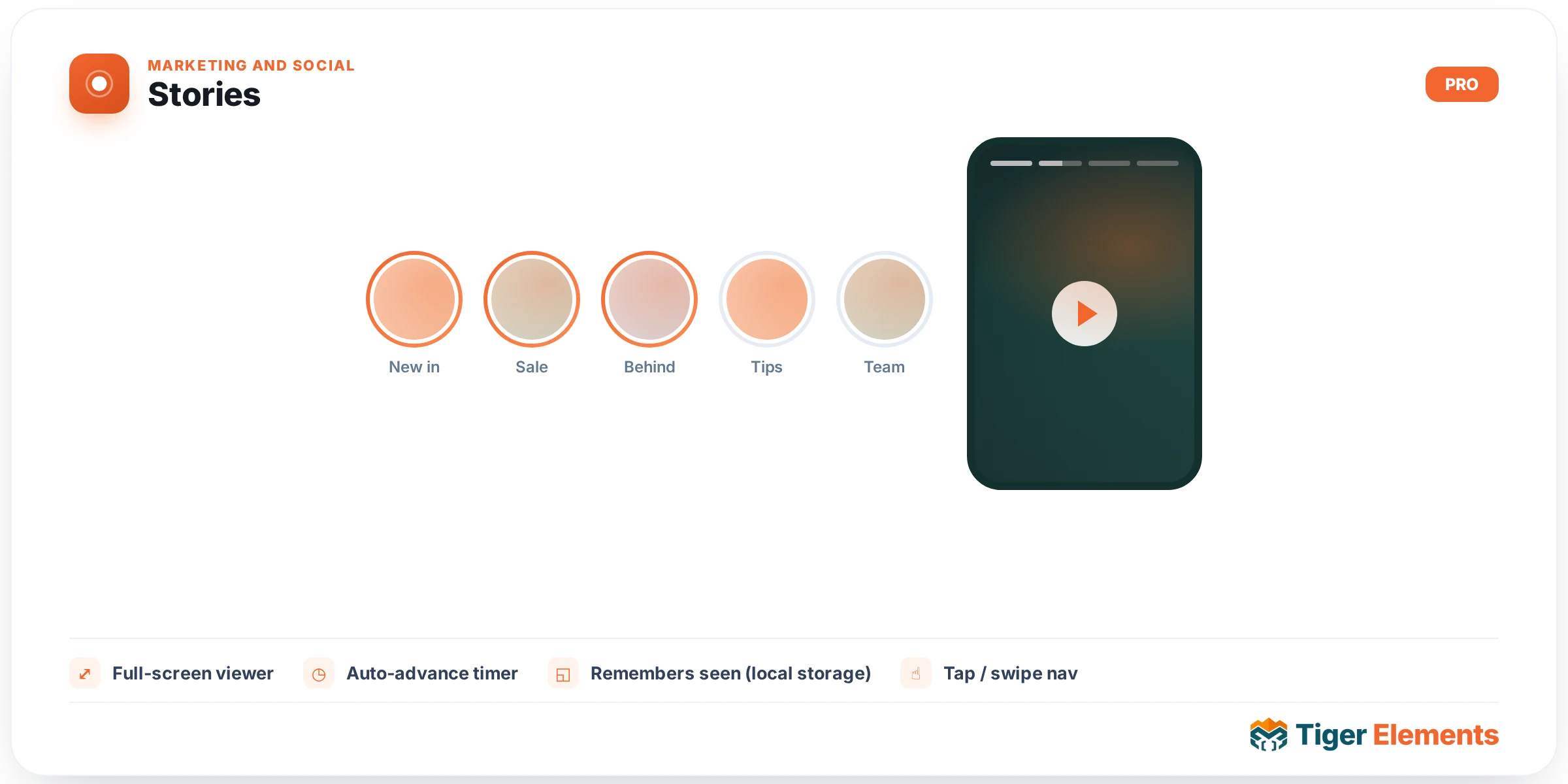
Stories brings the Instagram / Facebook “stories” pattern to your site: a row of circular avatar bubbles that open a full-screen, auto-advancing viewer. Each story plays its slides on a timer with segmented progress bars, and visitors tap, swipe or use the keyboard to move through them.
Key features
- Avatar bubbles — gradient “unseen” ring that switches to a muted “seen” ring once viewed (remembered per visitor via local storage).
- Full-screen viewer — segmented progress bars, timed auto-advance, and automatic hop to the next story when one finishes.
- Navigation — tap left/right (or click) to move between slides, arrows to jump between stories, swipe on touch, press-and-hold to pause, and keyboard support (←/→, Space to pause, Esc to close).
- Media — multiple image slides per story (via the gallery field) plus an optional video slide, each with an optional caption and call-to-action button.
Setting it up
- Add the Stories widget.
- Under Content → Stories, add a row per story: choose an avatar, a label, the slide images (and optionally a video), a caption and a CTA link.
- Set the default per-slide duration and whether the viewer auto-advances to the next story / loops.
- Style the bubbles, labels, rings, viewer overlay and progress bars on the Style tab.
Tips
- Keep slide durations between 3–6 seconds for a natural pace.
- Videos play muted and inline and use their own length; the duration field applies to image slides.
- The viewer respects reduced-motion preferences and locks page scroll while open.
Availability
Stories is a Pro widget. Enable or disable it under Tiger Elements → Widgets.
Tray styles: Instagram or Facebook
Under Content → Layout & Behaviour → Tray Style you can switch how the story tray looks:
- Bubbles (Instagram style) — circular avatars in a row with a gradient “unseen” ring and the name underneath.
- Cards (Facebook style) — tall preview cards showing each story’s cover image, with the avatar ringed in blue in the top-left corner and the name across the bottom over a scrim.
In Cards mode each story can have its own Card Cover image; leave it empty and the story’s first slide is used automatically. The Cards layout has its own style controls (card width, aspect ratio, radius, shadow, scrim, avatar size/offset, ring colours for seen/unseen, and name colour/typography). Both layouts share the same fullscreen viewer.