
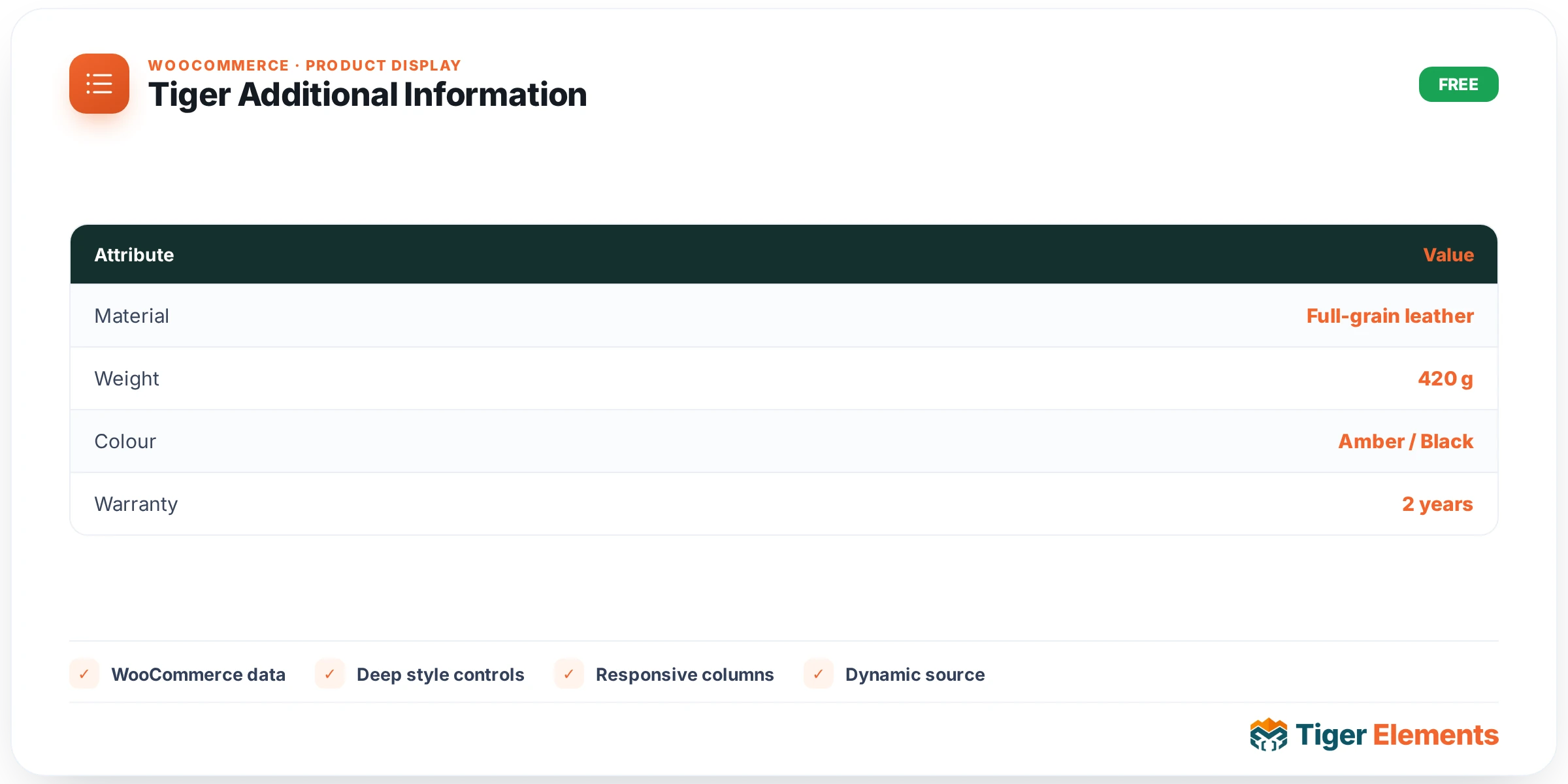
What Tiger Additional Information does
Tiger Additional Information renders the WooCommerce product attributes table — weight, dimensions, and any custom attributes defined on the product — for the current single product. Rather than rebuilding this logic, the widget calls WooCommerce’s own wc_display_product_attributes() function and captures its output, so custom attributes, units, and formatting behave exactly as they do in core WooCommerce. That native table is then wrapped in a .tg-padd container and given full table-level Elementor-Pro styling: borders, cell padding, row striping, hover states, and separate typography for label and value cells.
Like the other widgets in this family, it needs both WooCommerce active and a resolvable product (via $tiger_loop_post_id in a loop, or get_the_ID() otherwise) — so it only produces meaningful output on a single-product template or inside a product loop/archive card where a product is in scope.
Setting it up in Elementor
The Content tab, under Additional Information, has just two controls: Show Heading (a switcher, defaulting to off/empty rather than “yes”) and Heading Text (a text field with dynamic-tag support enabled, defaulting to “Additional information,” visible only when Show Heading is on via its condition). This is a meaningful default difference from WooCommerce’s native template, which always prints an “Additional information” heading — here you opt in explicitly.
The Style tab has three sections. Heading (only shown when Show Heading is enabled, via a section-level condition) offers Color, a Typography group control, and a responsive Spacing Below slider targeting the <h2> tag. Table covers a Border group control (targeting both table.shop_attributes and table.woocommerce-product-attributes selectors, since WooCommerce’s class name has varied across versions), a responsive Cell Padding dimensions control, Row Border Color, a Striping (odd rows) color for :nth-child(odd) rows, and a Row Hover Background color with a built-in 0.2s transition — plus separate Label Cell (Text Color, Background, Typography) and Value Cell (Text Color, Link Color, Typography) subsections. Container mirrors the pattern used across Tiger’s WooCommerce widgets: a Background group control (classic/gradient, no image), responsive Padding and Margin, a Border group control, responsive Border Radius (which also sets overflow:hidden so the table corners actually clip), and a Box Shadow group control.
Non-obvious behavior worth knowing
The widget is careful not to show an empty box: it buffers wc_display_product_attributes()‘s output first and checks whether the trimmed result is an empty string. If the product has no weight, no dimensions, and no custom attributes, the widget renders nothing at all on the live front end — no empty heading, no empty table shell. In the editor only, it instead shows the hint “This product has no weight, dimensions or custom attributes to display.” so a builder testing against a bare-bones sample product understands why the area looks blank, without that placeholder ever leaking to shoppers.
Because the heading is opt-in and off by default, if you enable Show Heading but leave Heading Text blank, the widget’s render check ('' !== trim($s['heading_text'] ?? '')) means an empty label simply skips the heading — you won’t get a blank <h2> tag. Also worth noting: Heading Text supports Elementor dynamic tags, so it can pull from ACF fields, a custom field, or other dynamic sources if you need a heading that varies per product rather than a static string.
When to use it vs. related widgets
The identically-named “Additional Information” concept also exists inside Tiger Product Tabs, controlled by its own Additional Information Tab switcher and Additional Info Label text field — but that tab renders through a completely different code path: woocommerce_output_product_data_tabs(), WooCommerce’s native tab dispatcher, which internally calls the very same wc_display_product_attributes() function this standalone widget calls directly. So the underlying data and markup are effectively identical; the distinction is purely about placement and packaging. Use standalone Tiger Additional Information when you want the attributes table to live in its own dedicated section — for example, directly below the product gallery, or as a full-width strip further down a landing-style product page — with independent control over its own container, border and striping. Use Tiger Product Tabs when you want it bundled with Description and Reviews into a single tabbed interface. Avoid enabling both the standalone widget and the Additional Information tab on the same template unless you intend for the same attributes table to appear twice, since neither widget is aware of the other.
Practical tips
- Test this widget against a product with at least one custom attribute (Product Data → Attributes) as well as one with only weight/dimensions set, since
wc_display_product_attributes()includes core dimension fields even when no custom attributes exist — the “empty” check only trips when literally none of weight, dimensions, or attributes are populated. - Set Striping and Row Hover Background together for a clearer, more scannable spec table — the hover transition is baked in at 0.2s, so you don’t need custom CSS for a smooth effect.
- If your theme’s default WooCommerce CSS already styles
table.shop_attributes, check for specificity conflicts — the widget’s Border and Cell Padding controls target both possible WooCommerce table class names, but a theme’s more specific selector can still win without!important. - Use Border Radius on the Container section (not the Table section) when you want rounded corners on the whole card — the container control adds
overflow:hiddenautomatically so the table’s straight edges get clipped correctly.