
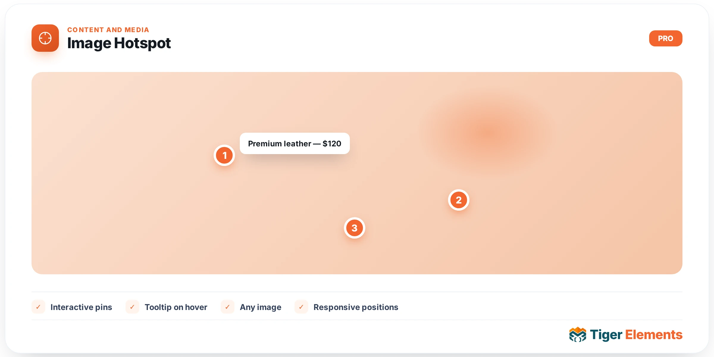
Places clickable, precisely positioned hotspot markers on top of a base image — a way to annotate a single photo, a floor plan, an infographic, or a product shot with interactive callouts, rather than requiring separate images or a wall of surrounding text to explain each individual detail. A visitor scans the image, notices the markers, and clicks whichever one they’re curious about — a considerably more engaging way to present multiple pieces of related information than listing them all as plain text underneath a static photo.
Setting up hotspots
Each entry in the hotspot repeater carries its own position on the base image and its own tooltip content, meaning every marker is independently configured — different positions, different text, different behavior — rather than sharing a single fixed template across the whole image. This per-hotspot independence is what makes the widget genuinely useful for real annotation work: a product photo might need a hotspot pointing at a specific fabric detail with one kind of description, and another hotspot pointing at a stitching feature with entirely different content, both existing on the same base image without interfering with each other.
Styling the indicator and the tooltip separately
The widget splits styling into two distinct concerns: the hotspot indicator itself (the visible dot or pulsing marker sitting on the image, drawing the eye toward it before any interaction happens) and the tooltip box that appears once a visitor hovers or clicks that marker (the content panel carrying the actual information). Keeping these separate matters because they genuinely serve different purposes — the indicator needs to be noticeable enough to invite interaction without overwhelming the underlying image, while the tooltip needs to be legible and well-composed once a visitor has already engaged and is reading the detail.
Choosing good hotspot placement
Because hotspots are positioned directly on the image rather than in a separate list, the base image itself needs to genuinely have distinct, spatially separate points worth calling out — a floor plan with clearly distinguishable rooms, a product photo with visually identifiable features, an infographic with naturally separated sections. An image without meaningfully distinct visual regions doesn’t give hotspots anywhere sensible to anchor, and cramming several markers into a small, visually undifferentiated area of an image makes them hard to target accurately, particularly on a touch screen.
Use it for
Product photography where specific features benefit from individual callouts (materials, technical specs, included components), floor plans or architectural renderings where each room or zone carries its own detail, and infographics or diagrams where a static image alone can’t comfortably fit all the explanatory text a visitor might want, but an interactive, click-to-reveal approach handles it cleanly.
Practical tips
- Space hotspots generously enough that each one is easy to target individually, especially considering touch-screen visitors — markers placed too close together become genuinely difficult to tap accurately on a phone.
- Keep tooltip content concise — a hotspot’s whole value is quick, digestible detail on demand; a tooltip stuffed with a long paragraph undermines the format’s inherent scannability.
- Choose a base image with real visual distinctiveness between the regions you’re annotating — hotspots work best when a visitor can already roughly guess what each marker relates to before clicking, purely from its position on the image.