
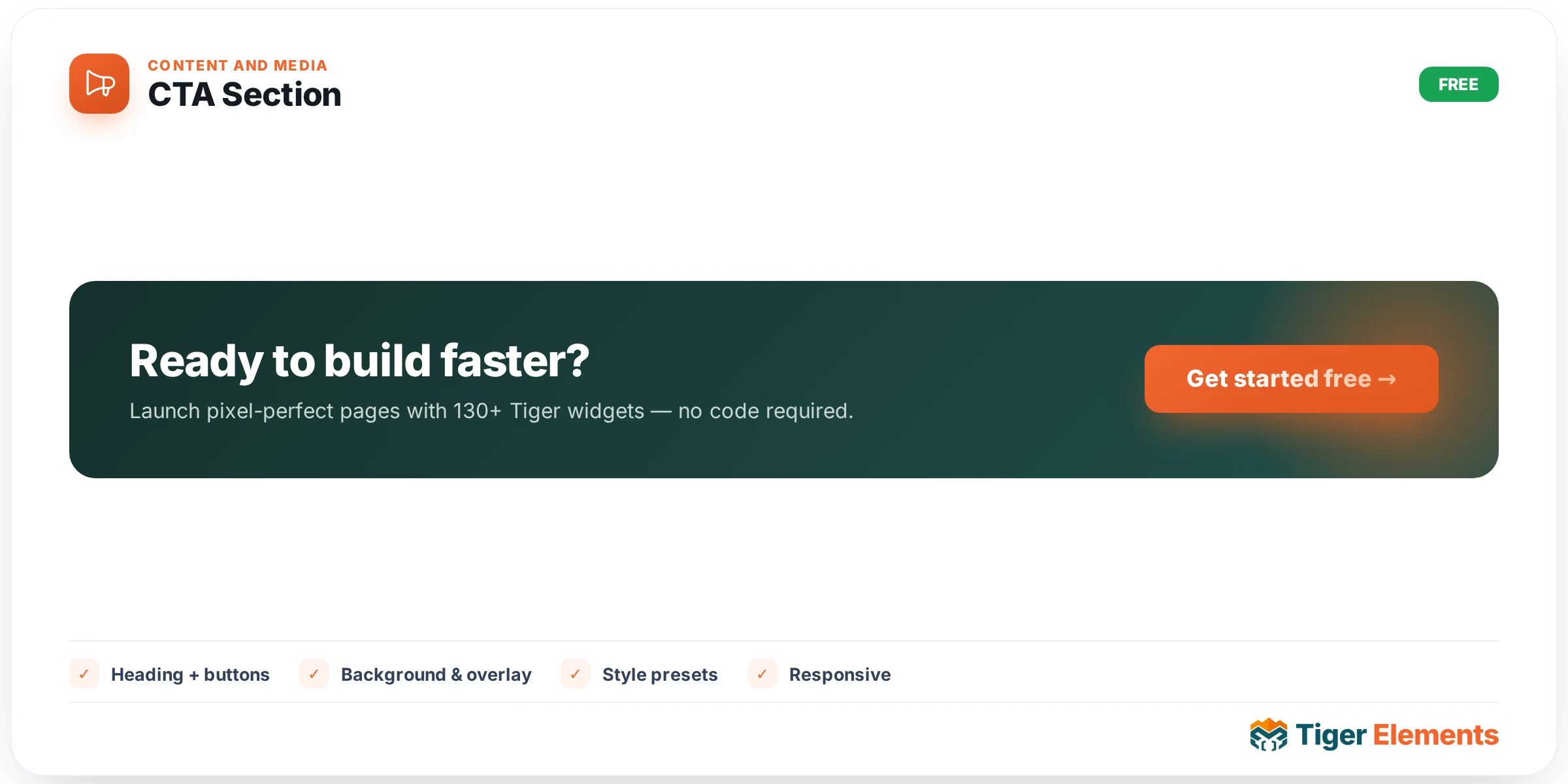
A dedicated call-to-action block with far more built-in structure than a generic section or container widget: heading and subtitle, social-proof and trust-badge rows, a ribbon or label element, an urgency countdown timer, an embedded newsletter/email-capture field, a feature-highlights list, one or more buttons, and background pattern options — all wrapped together with an entrance animation, so the entire block reads as one considered, cohesive design rather than several separate widgets stacked together and hoping to look unified.
Why a dedicated CTA widget instead of assembling one from parts
A call-to-action section is, in principle, buildable from generic pieces — a heading widget, some text, a button, maybe an Info Box for trust badges. The problem is that a genuinely effective CTA section usually needs several of these pieces working together with consistent spacing, color, and hierarchy, and hand-assembling that from separate widgets means manually coordinating every one of those relationships and re-doing that coordination work on every new CTA section a site needs. This widget bundles the pieces that CTA sections consistently need into one coherent unit, with the relationships between them (heading-to-subtitle spacing, badge-row placement, button prominence) already considered as a system.
The pieces available
Beyond the core heading and subtitle, several optional elements exist specifically because real, high-converting CTA sections often layer multiple persuasion techniques rather than relying on copy alone. Social-proof and trust-badge rows let you show logos, ratings, or customer-count figures right alongside the pitch. A ribbon or label element highlights a specific offer or status ("Limited Time", "New"). An urgency countdown timer adds genuine time pressure for offers with a real deadline. An embedded newsletter/form field lets the CTA itself capture an email address directly rather than only linking elsewhere. A feature-highlights list reinforces the offer’s specific benefits in scannable form alongside the main pitch. None of these are mandatory — a simple CTA section might use only heading, subtitle, and a button — but having them available within the same widget means adding urgency or social proof later doesn’t require rebuilding the section from scratch with different widgets.
Layout presets and background
Multiple layout presets cover the common CTA shapes seen across marketing sites — a full-width banner, a split layout pairing an image with the content, and a centered, focused layout — and background pattern options add visual texture beyond a flat color fill, giving the section more presence without requiring a custom background image.
Use it for
Pricing-page bottom CTAs ("Ready to get started?" with a button and maybe a trust-badge row), newsletter sign-up bands using the embedded form field, and any "convert here" section where urgency, social proof, or a highlighted feature list genuinely need to be part of the pitch rather than bolted on with separate widgets.
Practical tips
- Only enable the pieces that genuinely serve this specific CTA — a section with every optional element turned on simultaneously (countdown, badges, form, feature list, ribbon) can end up feeling cluttered rather than persuasive; choose the two or three elements that most support this particular offer.
- Only use the urgency countdown for offers with a real deadline — a countdown that resets or never actually expires undermines trust the moment a visitor notices.
- Match the layout preset to the content’s actual weight — a split image-plus-content layout suits a CTA with a genuine supporting visual, while a simpler centered layout works better when the copy and button alone carry the section.