
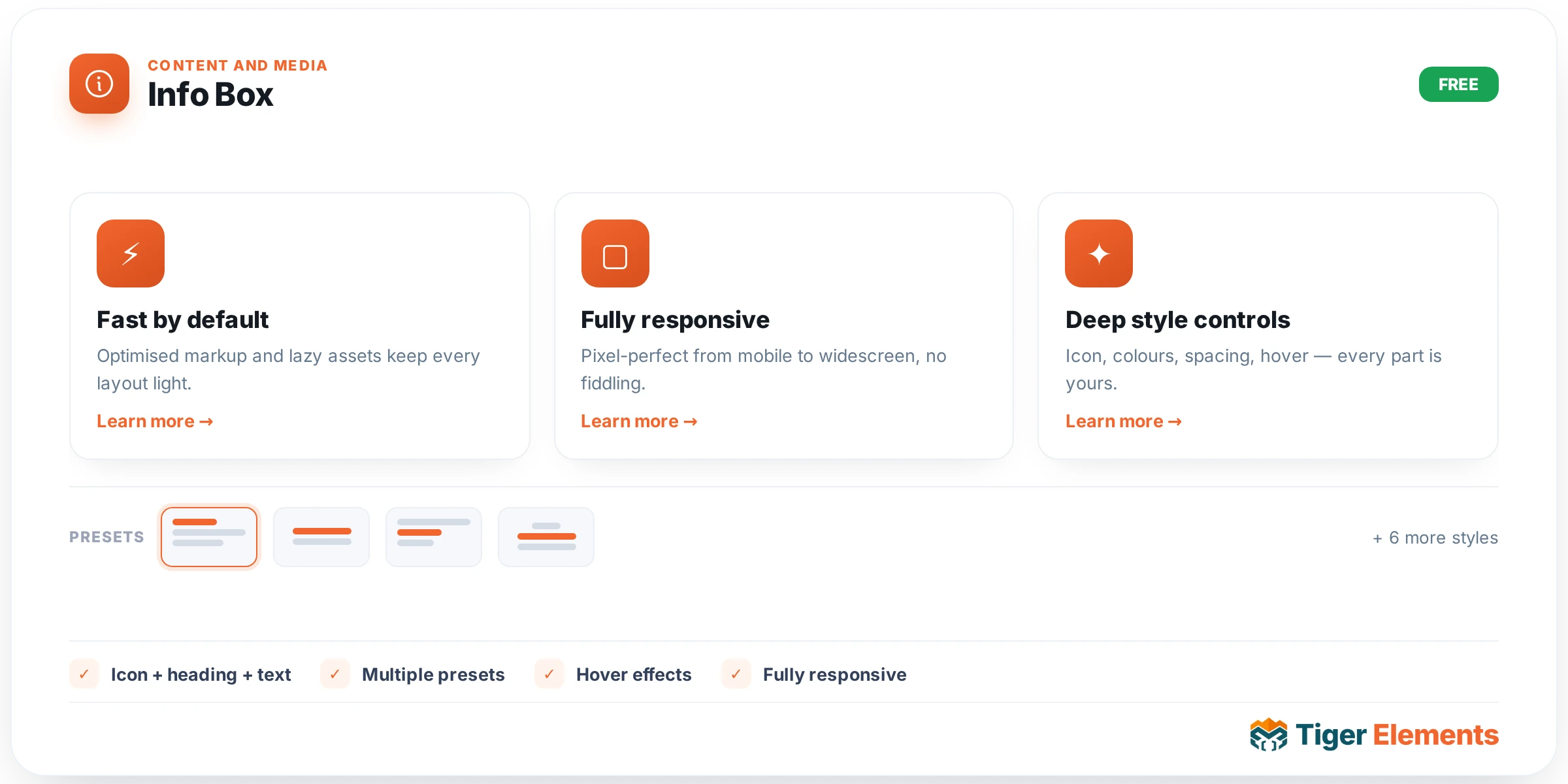
An icon-plus-text feature card — the standard "three benefits in a row" block found on nearly every marketing page — but with several genuine interaction options layered on top of the basics that a plain icon-box widget wouldn’t offer: a 3D hover tilt, a scroll-triggered reveal, and the option to make the entire card clickable rather than just a small button at the bottom.
Interaction options
3D hover tilt makes the card subtly rotate toward the visitor’s cursor position as they hover over it, a small but genuinely polished touch that signals interactivity in a more tactile way than a flat color change. Reveal on scroll animates the card into view the moment it enters the visitor’s viewport rather than simply being present from page load, adding a sense of pacing when several Info Box cards are stacked or gridded down a page. Whole box clickable is a genuinely practical usability decision: rather than requiring a visitor to precisely target a small text link or button at the bottom of the card, the entire card surface becomes the click target, which is both more forgiving on a desktop cursor and considerably easier to tap accurately on a touch screen.
A flexible graphic slot
The visual element at the top of the card isn’t locked to a single format. It accepts an icon (the classic feature-card treatment), a hover-swap image (one image shown at rest, a second revealed on hover — useful for a "before/after" hint or simply a more dynamic visual state change), a plain image (a photo rather than an iconographic symbol, suited to more editorial or photography-driven designs), or a number (turning the same widget into a numbered step in a process — "01", "02", "03"). Because all four options live on the same widget, a single Info Box can cover an icon-led feature grid, a numbered how-it-works sequence, and a photo-illustrated benefit list without switching between different widgets for each visual style.
Content beyond the headline
Beyond a title (with a configurable HTML tag) and a description, an optional bullet-point list repeater lets a card carry more granular detail than a single paragraph comfortably allows — useful when a feature genuinely has two or three distinct sub-points worth calling out individually rather than folding them into one dense sentence. A CTA text-and-link pair rounds out the card for cases where an individual feature benefits from its own dedicated action, separate from whatever primary call-to-action exists elsewhere on the page.
Use it for
The classic three- or four-column feature grid explaining what a product or service offers is the most common application, with the icon graphic type and reveal-on-scroll animation as the typical combination. A numbered "how it works" sequence — using the number graphic type instead of an icon — is a close second use case, walking a visitor through a process step by step. Whole-box-clickable combined with a CTA link suits a card that’s genuinely meant to drive a visitor toward a specific destination (a category page, a specific service’s detail page) rather than being purely informational.
Practical tips
- Turn on Whole box clickable whenever the card has a genuine destination — it measurably improves usability over a small embedded link, especially on mobile.
- Keep the 3D hover tilt effect subtle rather than dramatic — a card that tilts too aggressively can feel gimmicky rather than polished, undermining the professionalism the effect is meant to add.
- Use the number graphic type consistently across an entire sequence of cards — mixing numbered and icon-based cards within the same "how it works" row reads as inconsistent rather than intentional.