
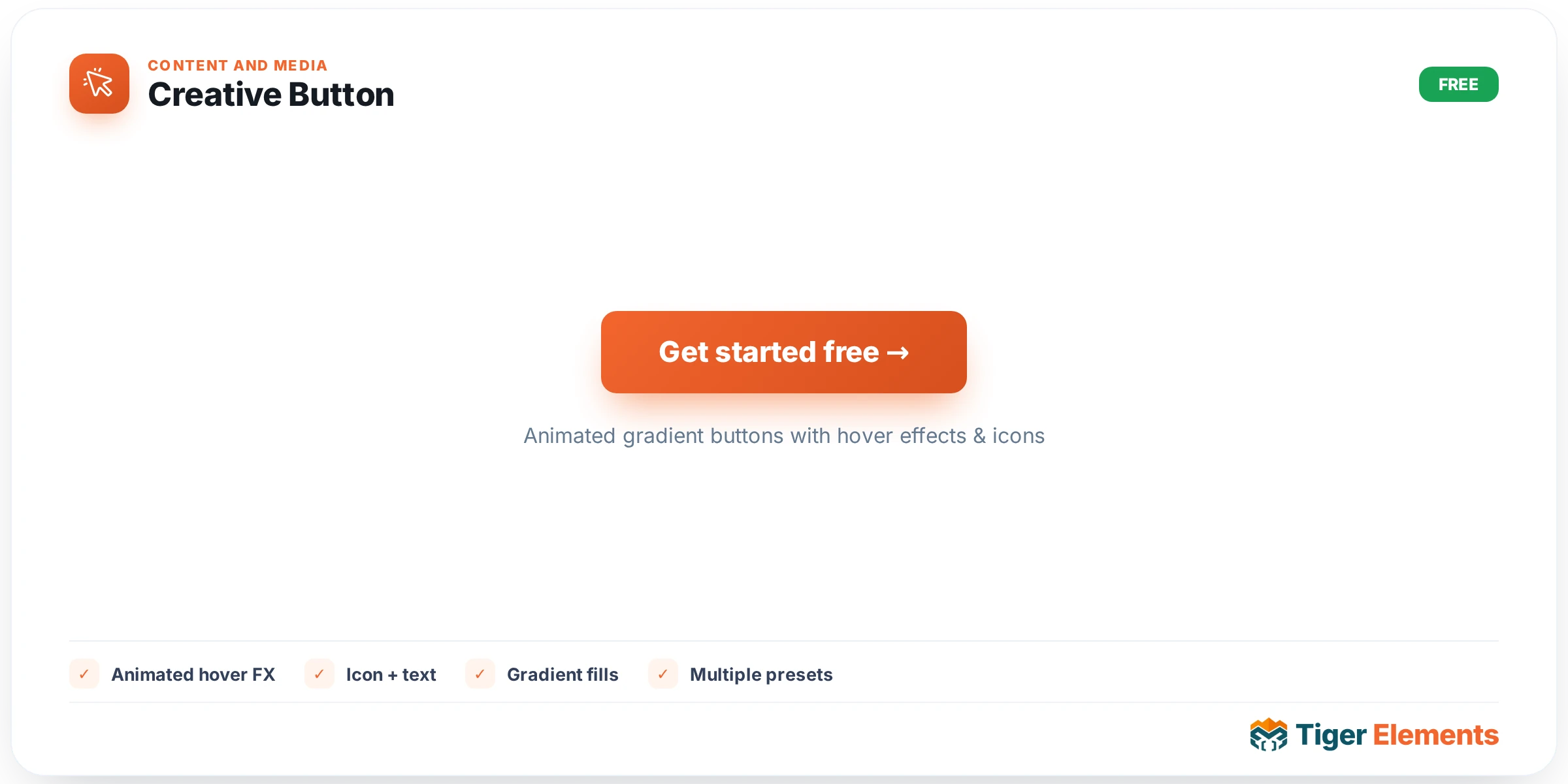
A button with hover animation genuinely built into the widget — a fill sweep, a gradient shift, icon motion — rather than the simple flat color-swap a standard button widget offers on hover. That distinction matters more than it sounds: a flat color change communicates "this is clickable" adequately, but it doesn’t communicate anything about the brand’s personality or the specific action’s importance the way a considered motion effect can. Creative Button exists specifically to give a primary call-to-action a moment of genuine visual interest the instant a visitor’s cursor lands on it.
Setting up the content
Beyond the button’s text, an icon can be positioned to either side of the label, and a full width toggle stretches the button to fill its container — useful inside a narrow sidebar or a mobile-stacked layout where a natural-width button would look small and disconnected from the surrounding content.
Color system: primary and secondary gradients
Rather than a single flat background color, the widget’s core visual identity comes from independently configurable primary and secondary gradient colors. This two-color foundation is what makes the hover animations feel considered rather than generic — a fill sweep or gradient shift effect needs two distinct colors to actually animate between, and having both exposed as separate controls means the effect can be tuned to match any brand palette, from a subtle two-tone variation to a bold, high-contrast sweep.
Text and background colors are further split into Normal and Hover tabs, so the button’s resting appearance and its activated appearance can each be styled independently — a design that starts dark-on-light and inverts to light-on-dark on hover, for instance, or one where only the background shifts while the text color stays constant throughout the interaction.
Icon sizing independent of text
Icon size and gap (the spacing between icon and label) are deliberately controlled separately from the button’s text sizing. This matters in practice because the hover motion — an icon sliding across the button, rotating in place, or scaling up slightly — needs to stay crisp and proportional at whatever button size you’re using; if icon sizing were locked to text sizing, a larger button meant for a hero section could end up with an icon that feels oversized or undersized relative to the motion effect applied to it, rather than staying visually balanced.
Use it for
Primary calls to action — the single button on a landing page or hero section that genuinely matters most, where a moment of hover polish reinforces its importance. Pricing-card "Get Started" or "Choose Plan" buttons are another strong fit, since the animated hover state helps that action stand out against the rest of a comparison-focused pricing table. It’s generally overkill for secondary or tertiary actions (a plain "Cancel" link, a minor in-page navigation button) where a simpler button widget’s flat hover state is entirely sufficient and won’t compete visually with the page’s actual primary action.
Practical tips
- Reserve this widget for the one or two buttons on a page that genuinely deserve the extra visual attention — using it everywhere dilutes the effect and makes every button compete for the same level of importance.
- Choose primary and secondary gradient colors that read clearly as a pair rather than two unrelated hues — a gradient that reads as a smooth, intentional transition looks far more polished than two colors that simply happen to sit next to each other.
- Check the hover animation on your actual button size before finalizing — an effect tuned and tested on a large hero button can look cramped or exaggerated on a smaller inline button, and vice versa.