
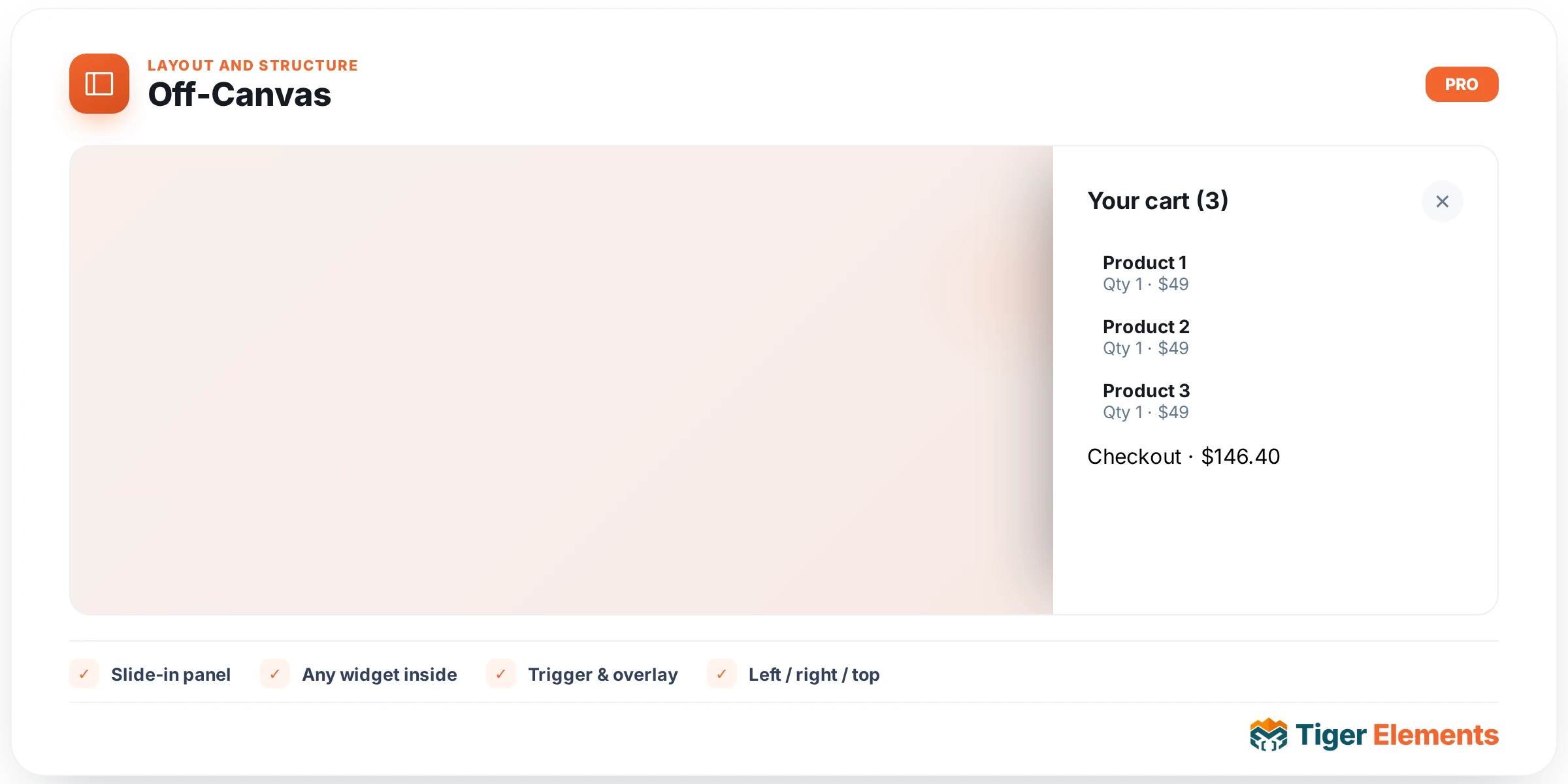
A slide-out drawer panel triggered by a button — the mechanism behind mobile navigation menus, filter sidebars, and slide-in mini-carts across virtually every modern website. Rather than baking that interaction into one fixed-purpose widget (a "mobile menu" widget that can only ever be a menu, for instance), Tiger exposes the underlying drawer mechanism itself as a standalone widget, so you can build any kind of off-canvas panel the site actually needs — a navigation drawer, a product filter panel, a shopping cart preview, a search overlay — using the same trigger-and-drawer pattern each time.
Setting up the trigger
The trigger side of the widget is what a visitor actually sees and clicks: a Button Text and Button Icon pair (a hamburger icon for a menu trigger, a filter icon for a filter panel, a cart icon for a mini-cart trigger — whatever fits the drawer’s purpose), with responsive Alignment so the trigger can sit differently on mobile versus desktop layouts if needed.
Choosing the drawer content
This is the part that sets Off-Canvas apart from a simpler fixed-content mobile-menu widget: rather than exposing a handful of built-in content fields, the drawer’s actual content is a Select Tiger Section control — a picker pulling from your saved section templates (built via the Theme Builder, the same "section" template type used elsewhere across Tiger Elements). This means the panel that slides out isn’t limited to whatever fields this widget’s author anticipated; it can contain literally any combination of ordinary Elementor widgets, because it’s a real, independently-designed section rendered inside the drawer. A navigation drawer can carry a full multi-level menu with icons and descriptions. A filter panel can carry checkboxes, price sliders, and a search box. A mini-cart drawer can carry line items, a subtotal, and a checkout button — the same complexity you’d expect from a dedicated cart page, just presented as a slide-out panel instead of a separate page visit.
Slide direction
A Slide Direction control chooses whether the panel enters from the left or the right edge of the screen — a decision that should generally follow existing UI conventions on your site: a right-side drawer for a cart or account panel (matching where those icons typically live in a header), a left-side drawer for primary navigation (matching how most visitors already expect a hamburger menu to open), though there’s no hard requirement either way beyond what feels consistent with the rest of your site’s layout.
Why a section template instead of inline controls
It’s worth understanding why this widget is deliberately built this way rather than offering its own set of content fields directly. A fixed-field approach — say, a repeater specifically for menu links — would work fine for a navigation drawer, but would be entirely wrong for a filter panel or a mini-cart, each of which needs a genuinely different content shape. By instead pointing at an arbitrary saved section, the same Off-Canvas widget covers every one of those use cases without needing a separate specialized widget per drawer type, and any future content need (a drawer showing a countdown timer, a newsletter signup, anything at all) is automatically supported because it’s just an ordinary Elementor section like any other.
Practical tips
- Design the section you’ll use as drawer content at roughly the width the drawer will actually render at — building it full-page-width first and then discovering it needs to be squeezed into a 320px-wide drawer means redesigning it, not just resizing it.
- Match slide direction to where the trigger icon sits in your header — a cart icon on the right edge opening a left-side drawer creates a visual disconnect that reads as a small but noticeable inconsistency.
- For a mobile navigation drawer specifically, keep the section’s content reasonably compact — a drawer that itself requires scrolling to see every menu item defeats some of the convenience a slide-out panel is meant to offer over a full page navigation.